Attachments


Upvote
0


I'm gonna guess without watching it again. Is it about a relationship running its course??
")
That was fantastic. So glad to see this come to fruition. Every frame was a picture. Every frame told a story.
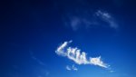
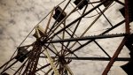
On a whole. I'd say it was about the latter stages of illness? Death. Making an appointment in Samara. It was all about the essence of time. The time lapses, drifting clouds, spinning wheel, the clock at the credits. There was also an emphasis of the white at the ice rink. Especially the close up when it seems to gleam from her skin.
The bench would be somewhat of a "waiting room", perhaps the chap who sat beside her was death, or another patient. The sketchbook being a momento, or rather catalogue of her life?
That's my guess at 08:39am.
Really enjoyed it.
")
Some amazing shots there! I enjoyed it a lot, although I wasn't a huge fan of the song- although I suppose thats more objective. But, I found it really, really well shot, especially for a first short
Awesome short, Ernest! You included some really beautiful and artful imagery. I wasn't a fan of the first few B&W shots as they looked a bit blown out, but all the color shots were spectacular.
If I had to guess about the story, the girl used to be a skater and is now on crutches from an accident of some sort? Maybe she can't skate anymore?
The sky shots were just gorgeous.
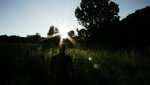
My guess is that it's about nature (girl) vs urban life (businessman).
Very nice, great job.
I often gripe at people about their color correction, image quality, etc. But this, this is right on the mark. Excellent.

the timelapse of those clouds......pretty orgasmic imagery.
Good stuff.
Really beautiful, Ernest. I especially dug the time-lapses, the stars (was that a bit of northern lights or just some clouds in the one shot?) in particular. It was cool how the rotation of the constellations made it look like a super smooth pan/circular dolly.
If I had to take a guess on the story, though it seemed pretty abstract, I'd say it's a girl reliving some memories through her sketches. She was a skater (most of those shots are blurry which maybe shows her current disconnection to that activity, due to the crutches?).
Not sure about the guy on the bench, though. At first I thought she was looking at his briefcase to steal it. But then in the end, he takes her sketchbook? If we go with PTP's suggestion that this short has to do with death, is the man a sort of 'Saint Peter,' with the bench being the 'Pearly Gates?' By looking at the sketchbook is he judging her life?
Nice job
Btw, was it an accident or could she never skate to begin with?
I love it! It's so nice viewing the work of an artist who actually composes for the moving frame.
Good question. The fact that she's just on crutches makes think she could skate or was a skater and had an accident because crutches are mostly for temporary injuries. If she were in a wheelchair I'd be inclined to think she could have grown up with MS or some permanent injury. But there is gray area here for sure and that's OK. Leaves something up to the imagination.
If you look at my notes, most of the relevant parts say wheelchair/crutches. I couldnt decide for the longest time.I'll hazard a complete interpretation based on what everybody has said.
It's an allegory. The girl represents nature, the businessman industrialized societies. At the beginning the girl is healthy. She can skate, the crutches aren't present. She becomes progressively crippled through contact with the businessman, like nature through industrial extraction.
The leitmotiv of time passing reminds us that there aint much time left for us to save nature. Actually some climate scientists like James Hansen seem to think it might already be too late. (That's the part I like most in the short: the timelapses and music instill a sense of urgency in us)
I have 2 explanations for the ending where the girl leaves her sketches for the businessman to see. It could mean that the most effective way for nature to plead her case is through the work of artists. As someone who has come to pay attention to trees after seeing them through the works of Cezanne, this makes perfect sense to me. The other interpretation I can think of is that after we have destroyed nature, the only thing left will be pictures of her.
It's a bit far-fetched but it's the nature of works of art to generate very diverse interpretations. I was listening to George Huang's DVD commentary of "Swimming with sharks". He said he found interpretations of his movie refreshing because it made him look at it from renewed perspectives. He was particularly fond of one from a French magazine, Les Cahiers du Cinema. It basically said that the movie was about 2 gay guys who had to kill the woman between them so they could be together. It sounds absurd but there are actually elements in the movie that support this view. For instance at some point Kevin Spacey grabs and holds Frank Whaley's hand, which is weird for 2 straight men.
 , but as you said, there is something in discovering ur own short in different ways through everyone else's interpretations. And i fear if i explained myself already, ppl would look at it my way and not theirs. So many wonderful things to think about are coming out of everyones comments!
Wow! I'm sort of drunk right now and can't really piece together a story from the abstract imagery, but it was incredibly beautiful! I look forward to seeing more from you, you have some fantastic skills!
My only gripe would be that there seems to be a vast difference in terms of how well done the black and white shots are to how well done the others shots are. But seeing as it's obvious you've tried to make those scenes vastly different, that may actually be some sort of artistic choice that I don't understand right now.
Seriously though, well done! Fantastic short!
so save a drink for me!