A couple of observations.
As a rule, it's generally considered better to rotate text (in Western languages) from left to right as that's the way we read. For "creative" purposes, there might be times when it's useful to generate a certain feeling of discomfort, but I'd be wary of doing so in an unsolicited pitch unless the brand prides itself on being provocative. And, as has already been pointed out, the change in direction is a bit unsettling too (especially the long view of the gap between front and rear labels, showing the defects in the bottle ... )
The background: it's as important as the product, so what does "off-white, with a thin strip of neutral grey across the bottom" say about the brand? Does this fit with the brand's colour scheme? Looking at their website, it appears that traits of gold are a key part of their visualisation. Again, if this is a pitch for new business, you need to present something that really resonates with their product.
I would say you're heading in the right direction, but if you can't stretch to hiring an Andy to whistle in the background

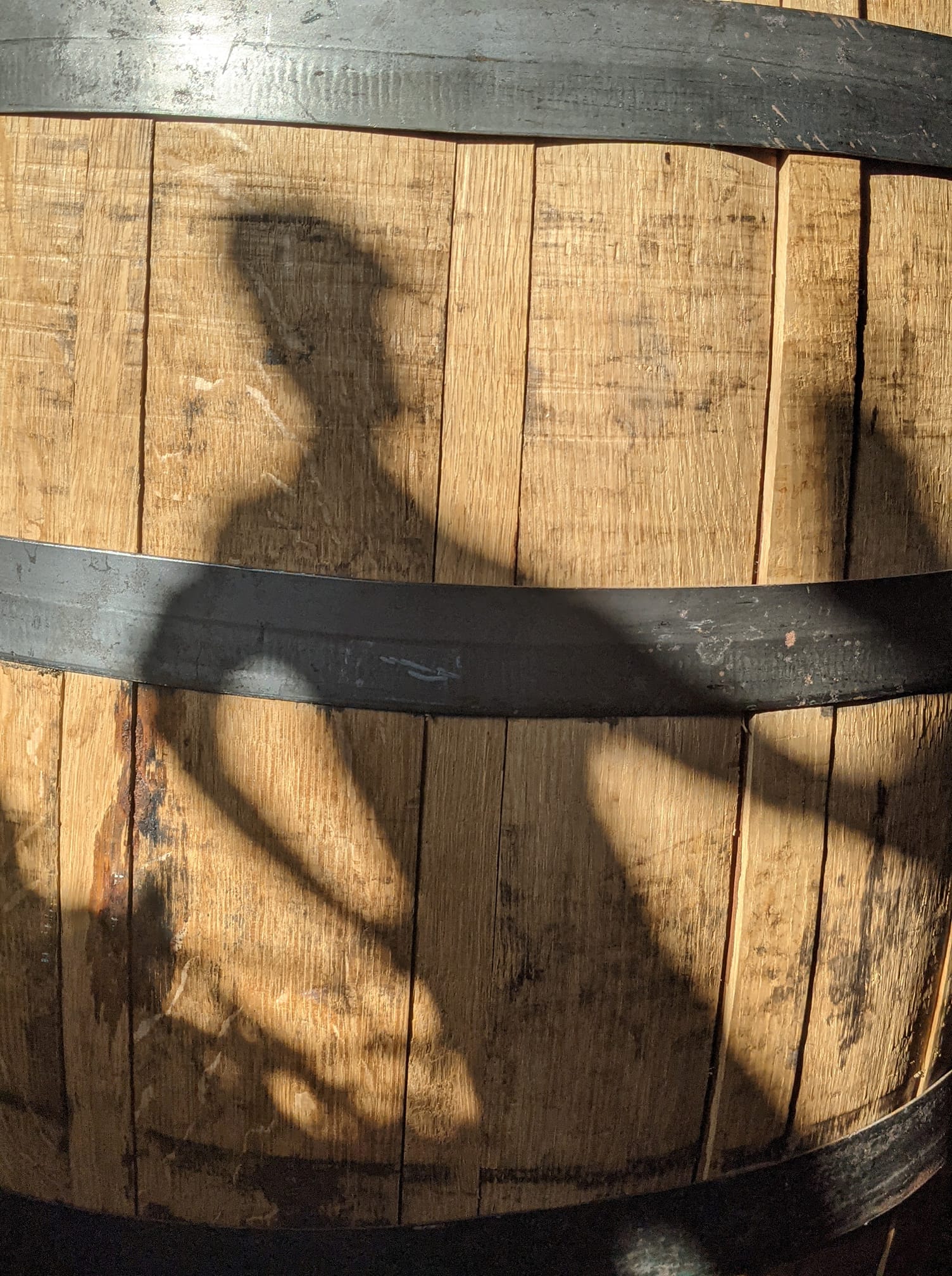
then you need to find and include more relevant details to show that you're in tune with the brand. I would definitely find a way to include some gold in there (could be as delicate as an inlay on the table, or a lighting effect); and I would think about having Andy's silhouette show on the background, even if only at the end ...


 then you need to find and include more relevant details to show that you're in tune with the brand. I would definitely find a way to include some gold in there (could be as delicate as an inlay on the table, or a lighting effect); and I would think about having Andy's silhouette show on the background, even if only at the end ...
