• Wondering which camera, gear, computer, or software to buy? Ask in our Gear Guide.

How to Create Interesting Shots: A Learning Thread

In another thread I posted a critique of a shot that Harmonica posted, comparing it to a shot from my short film Period Piece. It seemed like a good post to spin off into its own thread, so here it is. If you have shot you'd like critiqued, post a screen grab here and we can all point out what works and what doesn't work. I'll try not to be too harsh, but I will be honest. Sugarcoating doesn't help anyone to learn. I'd like to use this thread to help people improve on their usage of lighting and set design to create interesting imagery.

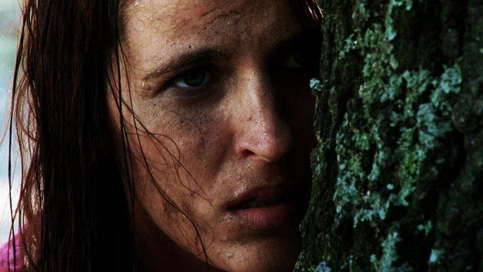
Here's a frame grab from my team's 48 Hour Film, Period Piece. I was the co-producer/co-writer/DP for the project. I'm not saying it's a perfect shot, it's not even close. In fact I actually took the frame grab to point out some flaws that we made.
x28byb.png


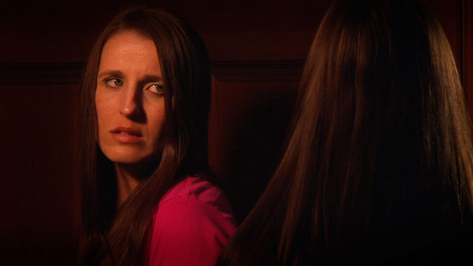
It is, however, a lot more interesting to look at than this frame grab from a clip Harmonica44 posted.

fz87m8.png


First off, there's depth to my image. In the foreground, you can see drink glasses and a bottle of ketchup. Then you have the two actors, the subjects of the shot. Behind, you have a table, the rest of the bar, a hallway, interesting ceiling beams, lights. All simple things on their own, but this all helps create a sense of depth and makes the frame interesting.

Now lets compare to Harmonica's shot. You have a guy crammed in a corner with a phone cord and light switch. I realize he's shooting in a house, but that just means he needs to work harder as a set designer. I'd suggest he move the actor away from the wall a bit, and have the actor on the right side of the frame. To the left of the actor have that statue, that adds something interesting to the shot. The actor is talking to someone, so maybe have this shot be over the shoulder, with the second actor's shoulder showing on the left side of the frame. On the wall add a poster, a photo, a shelf, anything. Just make it interesting. There's something on the wall in the upper left corner, but it's only barely in the shot so I have no idea what it is. Shooting in a residential location like a house doesn't mean you don't have to have set design. It means you have to work harder to get interesting shots.

Now onto the lighting. See John's face from Period Piece? It looks interesting. I'm not talking about the expression, I'm talking about the lighting. There's shadows, which always make a face more interesting. I'm not saying the dark side of his face isn't lit, it is. Even shadows need to be lit to get exposure. The shadows are just lit a few stops lower than the highlights. It's not perfectly lit, in a perfect world the highlights on his face would have been a bit darker. We were on an extremely tight schedule and didn't have time to tweak. I think the editor is actually fixing it in post for the non 48 hour cut of the film, but I'm not positive. I also would have liked to have a better hair light on the talent, but we couldn't pull it off on this shot.

Let's look at Harmonica's lighting. The subject is completely flat and evenly lit. The only shadow is under his chin. This looks extremely boring, and should be avoided at all costs. In the background I'm seeing double shadows everywhere. This can usually be avoided by using better placement of lights. As I haven't seen the whole scene I don't know what the motivation for Harmonica's light is, but I'm assuming he doesn't have one. When doing interiors it's nice to have a lamp or other practical light in the scene so the viewer knows where the light is coming from. You then base your lighting around that, and that can subconsciously explain the reasons for your lighting to the viewer.

I highly encourage people to post shots from their films. I'd like this thread to become a place where people can learn about lighting and set design. Again, I'm not trying to criticize people, I just want to help everyone learn. No one is perfect. There are two glaring mistakes from my shot that make me cringe every time I look at it. However, out of all the people I've shown the short to nobody has even noticed. Bonus points to whoever figures out what those mistakes are.
 
I'm not sure you should be posting a thread criticising Harmonica's work and using his framegrabs as examples.

Doesn't seem like a very nice way of doing business.

Exactly. And to be completely honest, that's why I tore into the other photo. Though, my criticisms were sincere. I work in a bar, and that looks like no bar I've ever been in. The actors in the foreground are lit way too much, in comparison to the background, which you can barely see. There shouldn't be so much contrast, in the amount of light between the two.

And, actually, David, I would have to wonder about the same thing, in the photo you posted. I don't know the context, so maybe there's a reason that explains why the background is completely dark. But in most normal, everyday situations, if I can see someone standing in front of me, I can usually also see the rest of the small/medium-sized room that is directly behind them. So, depending on the context, I would probably say that the background perhaps should've been more lit?

For purposes of discussion, what works, what doesn't work, anyone can feel free to pull any of these images, and post it here.
 
I guess I'll refrain from posting any more when Harmonica is involved. He posted a shot and asked how it could be improved, and I answered. Apparently being honest and trying to help people is too controversial. I want nothing more than for Harmonica and everyone else on this forum to succeed.
 
It seems that there is a belief that you posted the screen shot to tear it apart . I realize that Harmonica44 posted the shot to be critiqued and that this thread grew out of you comparing and contrasting his shot with one of your own. On the subject of total honesty in criticism, as long as it is honest and is not meant to hurt or offend the other person, I am all for it. From what I've read by H44, I don't think that his skin is as thin as some would seem to believe.
 
From what I've read by H44, I don't think that his skin is as thin as some would seem to believe.
I gotta give him credit where due: Dude's impressively resiliant.
He's like IndieTalk's ROCKY, he takes all sorts of abuse but keeps on going.
He may not win the championship, but the guy doesn't seem to be going down any time soon.
He keeps hangin' in there.
rockyandapollo.jpg


I've adopted the approach of just helping him where I can.
The amount of helpfulness everyone has poured onto him makes each of us a better person just for trying.
Additionally, I've learned a few useful things just by the rest of the IT community answering his fifty-eight bazillion questions.

I wonder if I should compose an epic length short of nothing but Wilhelm screams for every Harmonica question.

I dare you guys to dare me. :devil:
You know I will. ;)
 
Here are a few framegrabs from my shoot yesterday. I'd like to think I have the knowledge and skill to shoot simple shots like these, but then I see the dailes and realize I have got a LOT to learn. These were shot on video with just quick rough CC.

So here, learn from my mistakes:

barrier_test1.jpg


This is what happens when you try to shoot your subject in shade using just a single reflector, but everything in the background is in full harsh sunlight. My only choice was to shoot tighter, which fortunately works with my story. This is where you need an HMI light, to try to balance the light on the subject with the sunlight, giving you a more even exposure.

barrier_test2.jpg


This is supposed to be a dark scene with an orange tint. But I rushed the lighting and failed to give the actress on the left any backlight to separate her from the background. She kinda blends in with the background. Not good. And could this shot look any more like a soap opera? Ugh. Oh, and I didn't bother fixing the other actress's hair. She looks like Cousin It from the Addam's Family. *sigh*

barrier_test3.jpg


Let's count the number of things wrong with this one! Let's see...this was one of the last shots and I just said "screw it!" and just shot, paying no attention to the frickin' background. Nice calendar and massive paper towel roll coming out of her head. Plus, the backlight was too low. It's shots like these that make me want to jump off a cliff. Can't believe I let this go, but that's the price of impatience, laziness, and pure stupidity.

THE MORAL: Learn by making mistakes and try not to keep making them. Study lighting and composition and try to get better with every shoot. Even then, you'll still make mistakes. I know I sure did, as is evident by these shots.
 
I actually prefer the second shot (Harmonica's) to the first... and I'll explain why. There are obvious problems with both. In harmonica's specifically, the color has white balance problems and "Nobody puts actors in a corner!" Unless they want them to feel rapped and claustrophobic. I personally would have at least dressed the wall or added something to cover the phone jack. Otherwise, it's no a bad shot. You've got decent framing, exposure and focus for a no-budget/indie film kind of feel.

The first one (please don't take this the wrong way - and read through before reacting) shows the difficulties of subtlety in lighting. Changing the actor's shirt to something with no pure white in it (I don't allow whites in my costuming unless I want to make a point of overexposing them). As you've mentioned, the KEY LIGHT is a bit strong, and the options there are either to lower the level of the key ( Cheap Dimmer ) or raise everything else. I no longer say action without a "Last Looks" moment on the monitor with the Director, Producer and DP discussing the shot... all lighting is adjusted on this master image as well.

Using a larger space requires an attention to the depth as well as the framing. As the space grows away from the camera (and by nature, outward as well), there is a growing need to show the world - much harder to do on a budget. A fuller background and more stuff on the frame-right side of the bar would be more believable (although, I don't know the context of the shot either, so it's difficult to say whether or not the emptiness is important.) Specifically then, moving a couple of partly full glasses from the left of frame to the right of frame (mid ground) and adding a table or two with folks at it would imply the rest of the world off-screen.

In the Harmonica shot, it's not as necessary to show the world as the framing is so tight. We're inside the headspace of the single character already. It could use more dramatic lighting, but isn't necessary if it fits into the story and the piece. and it could use more dynamic framing if that's needed for the scene and the piece as well... but since there's so little space, I think it's easier to manage than the larger space in SE's shot.

For us, "Extra Credit" and "Blaze of Glory" were our first shorts using extras and deeper framings. Huge learning curve. I'm more interested in knowing the the writing/acting in either of these shots make me overlook the flaws.
 
Why is that guys tie like that? And the collars? Was it part of the story? And I still don't get the name tag, you were think it'd look real?

Some hard shadows on the subjects. Did you want the bg that dark?

Ladies chest looks a little hot.

Overall it's hard to assess some of this stuff because I don't know the scene or movie. Maybe you wanted all the stuff I'm asking about.

Context helps:

To be fair to myself, I didn't do the name tag thing, but other stuff I did build looked equally rough. No idea what happened to the tie, didn't notice it until after we were done.

B/G was supposed to be dark, but actually contain more specular light sources of its own. I really wanted it to look like a creepy darkened server rack behind them, but that never quite panned out. The idea was to have lots of little glowie lights like the one strip in the b/g of this shot.

Also, there was supposed to be a panel of soft light in the wall behind them (not from this angle, but from another it would have back-lit them nicely.) It ended up looking more like an aquarium when we were done, so that effect didn't work either. A miscommunication that falls on me. I thought I had asked for a large amount of diff to put on the window; should have just brought a roll. Without putting 250 or 216 or something similar on the glass itself, the effect I wanted was unattainable. This also happened on another set of windows for the same reason. :(

The idea was that they were in a darkened lab space light primarily by spotty pools - some of those sources were originally going to play in frame. Not all of those shots got taken though. :( The lighting starts like this, then house lights go off and the machinery does it's thing, the people are light by the machinery essentially. Once it's done I tried for a 3rd look for the "after procedure" portion. Another of my mistakes was over-complicating things. ;)

On the girl in this angle I should have added a thicker cut to drop the light on her shirt/chest by a stop or 2. I remember putting one in for the lab-coat guy (double net I think) in his single, but in the rush of things I neglected to do the same for the actress in this shot.

And I agree, I was going for a harder/source-y look early on in the film, but I should have managed my shadows better on talent.
 
Last edited:
@David: For your image, I would think the framing implies that this is the doctor's shot with a reverse being the woman's... yet the woman is lit much more strongly in this shot and the doctor is difficult to see as he is quite underlit. Seeing more of the background would make it feel less like it was shot in a theatre on a stage as well. The Key also seems a bit blue to me compared to the yellower backlight, but I can't see the practical motivation for the light to figure out if there's a reason for it.

@voodoogmr: I really like the texture of the first shot... the background can actually be dimmed in post with a mask (straight shape + luma) to correct, or on set with a semi-transparent black piece of fabric... you don't necessarily need to make the investment in a larger light to match the background, especially in a nice tight shot like that.

The other two shots can be pushed around in color a bit using CC, but the lack of separation from the background is certainly a problem... you may be able to raise the mids in the rest of the frame using a feathered oval mask around her face to separate it. I'd like to see some of the strong texture you've got in the first shot in the other two though... they also feel a touch underexposed.
 
Wow - if what Nick said about Harmonica's work is true than that is a bit harsh -

plus, he only started in this biz about 20 hours ago, right?

Sorry if my critique seemed harsh.
 
Context helps:

To be fair to myself, I didn't do the name tag thing, but other stuff I did build looked equally rough. No idea what happened to the tie, didn't notice it until after we were done.

B/G was supposed to be dark, but actually contain more specular light sources of its own. I really wanted it to look like a creepy darkened server rack behind them, but that never quite panned out. The idea was to have lots of little glowie lights like the one strip in the b/g of this shot.

Also, there was supposed to be a panel of soft light in the wall behind them (not from this angle, but from another it would have back-lit them nicely.) It ended up looking more like an aquarium when we were done, so that effect didn't work either. A miscommunication that falls on me. I thought I had asked for a large amount of diff to put on the window; should have just brought a roll. Without putting 250 or 216 or something similar on the glass itself, the effect I wanted was unattainable. This also happened on another set of windows for the same reason. :(

The idea was that they were in a darkened lab space light primarily by spotty pools - some of those sources were originally going to play in frame. Not all of those shots got taken though. :( The lighting starts like this, then house lights go off and the machinery does it's thing, the people are light by the machinery essentially. Once it's done I tried for a 3rd look for the "after procedure" portion. Another of my mistakes was over-complicating things. ;)

On the girl in this angle I should have added a thicker cut to drop the light on her shirt/chest by a stop or 2. I remember putting one in for the lab-coat guy (double net I think) in his single, but in the rush of things I neglected to do the same for the actress in this shot.

And I agree, I was going for a harder/source-y look early on in the film, but I should have managed my shadows better on talent.

It's hard. That's all I can say. It's hard to make the frame look cool.
 
Using a larger space requires an attention to the depth as well as the framing. As the space grows away from the camera (and by nature, outward as well), there is a growing need to show the world - much harder to do on a budget. A fuller background and more stuff on the frame-right side of the bar would be more believable (although, I don't know the context of the shot either, so it's difficult to say whether or not the emptiness is important.) Specifically then, moving a couple of partly full glasses from the left of frame to the right of frame (mid ground) and adding a table or two with folks at it would imply the rest of the world off-screen.

Right. I did actually mean what I said, in that first response I posted. This kind of lighting is something I see so very often, in low-budget stuff, but I would honestly take natural lighting over it. If you can't properly light a large space, shoot in a smaller space.
 
@David: For your image, I would think the framing implies that this is the doctor's shot with a reverse being the woman's... yet the woman is lit much more strongly in this shot and the doctor is difficult to see as he is quite underlit. Seeing more of the background would make it feel less like it was shot in a theatre on a stage as well. The Key also seems a bit blue to me compared to the yellower backlight, but I can't see the practical motivation for the light to figure out if there's a reason for it.

That pretty much summarizes the lighting for the project. We wanted much of the lighting to come from objects in scene. Occasionally the motivation aspect works, but in general I should have dialed it back a few notches. Everything comes off as over-lit and heavy handed.

Still, as a "learn from my mistakes" image I think it has some value. ;)
 
Right. I did actually mean what I said, in that first response I posted. This kind of lighting is something I see so very often, in low-budget stuff, but I would honestly take natural lighting over it. If you can't properly light a large space, shoot in a smaller space.

Pretty good advice, here. The depth of space can actually harm you when you don't have enough money, so shrinking it and offering the illusion that the space is smaller will allow you to be a bit more creative.

I didn't realize the first post was the one from the other thread, I would've chimed in a bit earlier. But, now that it's all said and done I'd offer up some more light on the subject. Pun mildly intended.

Lighting is about control, not so much wattage. And, composition is more important than that in nearly any given situation. Which goes along with what I quoted above.

x28byb.png


Albeit out of context, perhaps a different still from this setup may have given you a different response. Right now, here's what I see:

-. Key's two stops over
- Shadow's spilling across talent's faces and throats (the girl doesn't look pretty in this still)
- DSLR overall over-exposure, which might be why the skin's gone pasty.
- Rim's vanishing because of the over-exposure- scant eyelights -- can't see the eyes, makes them look dead.
- Chaotic foreground element. Slider shot, so you really wouldn't be able to tell when they clear frame, hopefully they did?

Overall, it looks lit and ultimately flat. Not just because of the light, though, but because it's not a very strong composition. Again, it could be the still you posted, though.


fz87m8.png

Someone already mentioned it, but a simple white balance and a bounce board could've fixed this. Funny thing is? I can see this guys eyes and he's alive to me, so that's already doing justice to the talent on screen.

Even faux matting for 1.85:1 would change the context of it.

And, speaking of context, again Cracker mentioned that it seemed it was 'right' for what H44 was going for, so in that vein it's actually working for him, not against him.

That's my two cents on those pair.
 
@voodoogmr: I really like the texture of the first shot... the background can actually be dimmed in post with a mask (straight shape + luma) to correct, or on set with a semi-transparent black piece of fabric... you don't necessarily need to make the investment in a larger light to match the background, especially in a nice tight shot like that.
Thanks. My wider shots have very blown-out backgrounds, but it wasn't as noticeable in this tight shot. I'll definitely try the fabric or maybe some ND film on a frame in the future. Great tip. Now, excuse me while I say "Duh!" to myself :)

The other two shots can be pushed around in color a bit using CC, but the lack of separation from the background is certainly a problem... you may be able to raise the mids in the rest of the frame using a feathered oval mask around her face to separate it. I'd like to see some of the strong texture you've got in the first shot in the other two though... they also feel a touch underexposed.
My temp color grade crushed the black levels, but yeah, they were slightly underexposed. That's a good idea about using the mask. Just hope I can keep the noise down in the BG. Oh well, live and learn.
 
The girl in
Sineater's pic has a shadow bisecting her face and the right check looks two toned as if she has a skin pigment disease. Also agree with Kholi that foreground is ill defined. But at least there IS a foreground.

My favorite part of the frame is the background.
 
H

So here, learn from my mistakes:

barrier_test1.jpg


This is what happens when you try to shoot your subject in shade using just a single reflector, but everything in the background is in full harsh sunlight. My only choice was to shoot tighter, which fortunately works with my story. This is where you need an HMI light, to try to balance the light on the subject with the sunlight, giving you a more even exposure.

Only thing that's missing to me is an eyelight. Other than that, at least from the still, there's nothing wrong with this shot.

The rest you nailed, I think. I don't know the space, but the best you could've done was to either pull them away from the walls or make a committed choice on OTS or CU's.

The second frame doesn't look like committal, it's bouncing back and forth between an OTS and a tight single. It wouldn't look much different if you took the gal's head out of the frame. That's another composition thing.

Same with the last, she's right against the calendar, so it doesn't help the frame much.

IMO, you don't need HMI's or anything like that. They're nice, but being able to work with smaller lamps and learning to control light through composition and blocking goes further.
 
Back
Top