• Wondering which camera, gear, computer, or software to buy? Ask in our Gear Guide.

How to Create Interesting Shots: A Learning Thread

In another thread I posted a critique of a shot that Harmonica posted, comparing it to a shot from my short film Period Piece. It seemed like a good post to spin off into its own thread, so here it is. If you have shot you'd like critiqued, post a screen grab here and we can all point out what works and what doesn't work. I'll try not to be too harsh, but I will be honest. Sugarcoating doesn't help anyone to learn. I'd like to use this thread to help people improve on their usage of lighting and set design to create interesting imagery.

Here's a frame grab from my team's 48 Hour Film, Period Piece. I was the co-producer/co-writer/DP for the project. I'm not saying it's a perfect shot, it's not even close. In fact I actually took the frame grab to point out some flaws that we made.
x28byb.png


It is, however, a lot more interesting to look at than this frame grab from a clip Harmonica44 posted.

fz87m8.png


First off, there's depth to my image. In the foreground, you can see drink glasses and a bottle of ketchup. Then you have the two actors, the subjects of the shot. Behind, you have a table, the rest of the bar, a hallway, interesting ceiling beams, lights. All simple things on their own, but this all helps create a sense of depth and makes the frame interesting.

Now lets compare to Harmonica's shot. You have a guy crammed in a corner with a phone cord and light switch. I realize he's shooting in a house, but that just means he needs to work harder as a set designer. I'd suggest he move the actor away from the wall a bit, and have the actor on the right side of the frame. To the left of the actor have that statue, that adds something interesting to the shot. The actor is talking to someone, so maybe have this shot be over the shoulder, with the second actor's shoulder showing on the left side of the frame. On the wall add a poster, a photo, a shelf, anything. Just make it interesting. There's something on the wall in the upper left corner, but it's only barely in the shot so I have no idea what it is. Shooting in a residential location like a house doesn't mean you don't have to have set design. It means you have to work harder to get interesting shots.

Now onto the lighting. See John's face from Period Piece? It looks interesting. I'm not talking about the expression, I'm talking about the lighting. There's shadows, which always make a face more interesting. I'm not saying the dark side of his face isn't lit, it is. Even shadows need to be lit to get exposure. The shadows are just lit a few stops lower than the highlights. It's not perfectly lit, in a perfect world the highlights on his face would have been a bit darker. We were on an extremely tight schedule and didn't have time to tweak. I think the editor is actually fixing it in post for the non 48 hour cut of the film, but I'm not positive. I also would have liked to have a better hair light on the talent, but we couldn't pull it off on this shot.

Let's look at Harmonica's lighting. The subject is completely flat and evenly lit. The only shadow is under his chin. This looks extremely boring, and should be avoided at all costs. In the background I'm seeing double shadows everywhere. This can usually be avoided by using better placement of lights. As I haven't seen the whole scene I don't know what the motivation for Harmonica's light is, but I'm assuming he doesn't have one. When doing interiors it's nice to have a lamp or other practical light in the scene so the viewer knows where the light is coming from. You then base your lighting around that, and that can subconsciously explain the reasons for your lighting to the viewer.

I highly encourage people to post shots from their films. I'd like this thread to become a place where people can learn about lighting and set design. Again, I'm not trying to criticize people, I just want to help everyone learn. No one is perfect. There are two glaring mistakes from my shot that make me cringe every time I look at it. However, out of all the people I've shown the short to nobody has even noticed. Bonus points to whoever figures out what those mistakes are.
 
Well, if you wanna open yourself up to honest critique, to be frank, I'm not entirely sure I'd pick either one of these ahead of the other.

Harmonica's shot has a very naturalistic, real-world, mockumentary kind of feel. It looks like something that was shot with a camcorder. Heck, for all we know, that's exactly what he wanted.

Your shot, while perhaps better-composed, I'm not quite sure that I'd say it's better-lit. It's more lit, but that doesn't necessarily make it better. To be honest, the lighting looks very unnatural. I don't know of any bar, in the entire world, in which people sitting at the bar would be so exposed. Also, we should be able to see more of the background.

The effect is jarring. It reminds me that I'm watching a movie.

Also, those cocktail glasses in the foreground -- the way they are, they're really only distracting to me, especially with the ketchup bottle poking out from behind of one of them. If you want to use them as a frame for the shot, I think you'd be better off REALLY bringing them into the foreground, and off to the side.

And finally, harmonica, you gotta white-balance.
 
Really? You wouldn't pick one over the other? Sure, there are some flaws in the first frame, and you make a valid point about bar lighting, but seriously? Even documentary filmmakers compose shots to have depth or pick locations that will add production quality and reveal more information about the subject. I'm not trying to be offensive to harmonica, but there is a big difference between the two.

@ray, is one of those flaws the cord hanging down in the left side of the frame?
 
What we need is someone's self-created submission and permission to flog an admitted cinematic monstrosity.

In someone's spare time, they could actually shoot a tutorial short on sh!t cinema style.
Shoot a sh!t short, essentially.

"It's bad. I know it's bad. I want you to see how and why it's bad. What would be better is if... "
And we can use it as a public domain reference piece.
 
Well, if you wanna open yourself up to honest critique, to be frank, I'm not entirely sure I'd pick either one of these ahead of the other.

Harmonica's shot has a very naturalistic, real-world, mockumentary kind of feel. It looks like something that was shot with a camcorder. Heck, for all we know, that's exactly what he wanted.

Your shot, while perhaps better-composed, I'm not quite sure that I'd say it's better-lit. It's more lit, but that doesn't necessarily make it better. To be honest, the lighting looks very unnatural. I don't know of any bar, in the entire world, in which people sitting at the bar would be so exposed. Also, we should be able to see more of the background.

The effect is jarring. It reminds me that I'm watching a movie.

Also, those cocktail glasses in the foreground -- the way they are, they're really only distracting to me, especially with the ketchup bottle poking out from behind of one of them. If you want to use them as a frame for the shot, I think you'd be better off REALLY bringing them into the foreground, and off to the side.

And finally, harmonica, you gotta white-balance.

I fully encourage everyone to rip my scene to shreds. I find the whole frame cringe-worthy. I do agree that it's jarring, and not perfectly done. Or even well done, for that matter. As is, I don't really find the scene useable, and for anything other than a 48 Hour contest I wouldn't have released it. I'm hoping the exposure can be massaged in post for the non-48 hour cut of the project, but if not so be it.

In real life, though, the bar area is ridiculously exposed compared to the rest of the bar. We shot some test footage when the bar was open without any of our lights, and it still looked jarring compared to the background. I wish I had that test footage to post a frame grab, it's the weirdest bar lighting I've ever seen.

For the not enough background comment, this is actually part of a dolly shot. As the shot dollys you see more background. As for the cocktail glasses, they are where they're placed to keep continuity with a previous shot. I don't particular like the way it ended up looking but continuity is king.

I'm not really even trying to defend my shot, just trying to give insight into why it was shot and lit the way it was. Had we not been contending with time limits and rolling blackouts in the city it could have been far nicer. As stands, it's definitely worthy of criticism.
 
I'm not sure you should be posting a thread criticising Harmonica's work and using his framegrabs as examples.

Doesn't seem like a very nice way of doing business.

I hadn't really considered there would be an issue as he specifically posted the clip asking for how it could be improved. If Harmonica or the mods have any issues I'll take it down.
 
@ray, is one of those flaws the cord hanging down in the left side of the frame?

I'm not Ray, but yes, that's one of the flaws. The other is a clamp light with C47s hanging from the ceiling over Sara's left shoulder. It's a minor thing no one really notices, but it annoys me to no end.
 
Last edited:
Sin
I like your shot, but I think the lighting on the girl is wrong. It's overlit. The lighting on the guy is better but still a little too much. They don't look like they're in a bar. But the composition I like a lot and can't criticize. What did you use to light the guy and girl?
 
Last edited:
Sin
I like you shot, but I think the lighting on the girl is wrong. It's overlit. The lighting on the guy is better but still a little too much. They don't look like they're in a bar. But the composition I like a lot and can't criticize. What did you use to light the guy and girl?

At this point into the 48 hours I was ridiculously tired, but I'll try to recount the best I can. There was a 650w Arri Fresnel to the right of the frame. A 150w Fresnel was used as a hair light, but it ended up having to be moved so far out of frame it's not really doing much for this shot. There are practical hanging lights above the bar that are on. There's a 300w Fresnel in the back to the left of the frame behind a wall. I think I flagged it to leave John's face darker. He was coming back to finally try to hook up with the girl, so the thought process was he was turning to the dark side. There's a clamp light hanging on the ceiling to the left, but I don't think it's actually doing anything for this shot, it comes into play after the camera starts dollying.

EDIT:
I think I'm wrong. The 300 was moved way down the bar for the end of the dolly shot. I think Sarah is being mostly lit by the 650w, a practical hanging light directly above her, and a clamp light to the left of her.
 
Last edited:
At this point into the 48 hours I was ridiculously tired, but I'll try to recount the best I can. There was a 650w Arri Fresnel to the right of the frame. A 150w Fresnel was used as a hair light, but it ended up having to be moved so far out of frame it's not really doing much for this shot. There are practical hanging lights above the bar that are on. There's a 300w Fresnel in the back to the left of the frame behind a wall. I think I flagged it to leave John's face darker. He was coming back to finally try to hook up with the girl, so the thought process was he was turning to the dark side. There's a clamp light hanging on the ceiling to the left, but I don't think it's actually doing anything for this shot, it comes into play after the camera starts dollying.

EDIT:
I think I'm wrong. The 300 was moved way down the bar for the end of the dolly shot. I think Sarah is being mostly lit by the 650w, a practical hanging light directly above her, and a clamp light to the left of her.

I'm not a DP, though sometimes I pretend I am, but I'm thinking a bar might be a hard thing to light. All those neon signs, some flashing, glass and bottles reflecting light all over the place, I think it's not the easiest thing to light properly.
 
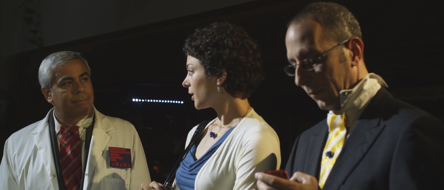
Well, I read this thread as a place for folks to put up something where others can learn from their mistakes. I know I've made some level of mistake on just about every still or motion frame I've tried to create, so here's one just for kicks.

This is a frame from a sci-fi short that I shot last year. A friend/co-worker of mine was the writer/director. I do like the film as a finished piece, and our actors were awesome. I feel that I failed the piece logistically and was largely responsible for us not making our day. :( That said, a very smart gaffer recently told me, "I think you're too hard on yourself, why you trippin', Go!" after having seen it. He's probably right, he's much smarter than I. :)

The scientist there is showing the married couple the equipment for their "procedure." This shot represents medium coverage of what was a very wide shot showing part of the space, those three folks, and some technicians working in mostly darkness to their right (frame left).

Aside from slightly awkward blocking, there are a lot of things where I, as the DP, failed the shot:

-- #1 Rule: If there is a question about something, the answer is: It Plays in 4K. Note the name badge. That would have worked great if we were shooting 16mm or something, but in 4K it looks exactly like what it is. We were plagued by this problem the whole day. I really should have known better, but I think we got caught up in the fun of building props and forgot completely.

-- We never got to take a good set of wides of the space as a whole, which would have placed the tungsten light that is hair lighting the couple in the geography. (They were small spotlights on the central device that I was cheating around) My biggest mistake though is in this series of shots. I stupidly let the light spill onto the scientist as his key. Does not work with his skin tone under this color temp at all. What I should have done was flagged it off of him completely and kept it as just a hair light. Then cheated in some bounce light onto him for this shot and for his single.

A001_C005_0912KW.jpg


There are other things not to like about this frame, but I'll leave that to you guys. ;)

Later I'll probably toss up a couple other shots for kicks.
 
Why is that guys tie like that? And the collars? Was it part of the story? And I still don't get the name tag, you were think it'd look real?

Some hard shadows on the subjects. Did you want the bg that dark?

Ladies chest looks a little hot.

Overall it's hard to assess some of this stuff because I don't know the scene or movie. Maybe you wanted all the stuff I'm asking about.
 
Of course, I like the SinEater shot much more. I liked it besides and because of the "mistakes (already pointed). Sin's shot tells me a story, the "mistakes" are actually effects.
In harmonica's shot I see only bright yellow and a bit of red... and not a bad looking guy...
 
Harmonica's film is actually just about twenty seconds of a guy (I presume him) talking to the camera explaining why a film should be controversial (and have lots of gratuitous rape scenes). It's not narrative work and it seems fairly impromptu so I don't think this is a fair comparison and as far as I'm concerned this thread is simply here as another excuse to laugh at Harmonica, which isn't very nice.

But Harmonica, if you're reading this, you need to sort out your white balance.
 
Personally here is how I feel about these shots,

First photo the key light is a little too harsh on the guy but the girl's lighting is pretty good except there's a shadow across her face and the background is a little too black and not enough depth.

The second photo I can see a little bit of darkness under the eyes and the shadows given off by the things in the room make it look like it's lit wrong - I mean, there must be 3 or 4 different light sources hitting the picture on the wall and the chair - they have like 4 shadows. And I personally would never keep a wire hanging out of the wall or a light switch in the background..

Just my 2 cents, though.
 
Back
Top