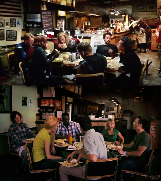
Isn’t it amazing that excellent lighting doesn’t look like “lighting”?i think there was 1 or 2 lits only. one on the ceiling may be other one in right side
See how the background of the second picture drops into darkness
and how it pops in the first picture? That’s because there are three
or four lights on just the background - the woman cleaning the floor
as a light on her. The four practical lights over the counter have been
replaced with bigger lamps and two small lights have been placed over
the flat top. So that’s six to eight lights just for the background not
counting the practicals.
There is a an overhead soft light just up stage from the camera to
keep the camera side darker. To keep the faces of the two actors facing
the camera at the same level there is a light on each of them.
Notice how the backs of the actors in the second picture are lighter
and everything else's falls off farther away. One light - probably coming
from a window and then only practical which do not have to power to
balance the light from the window.
Good lighting doesn’t look like lighting at all - it looks natural. The second
picture is exposed - the first is lit. And doesn’t look it.