
You are using an out of date browser. It may not display this or other websites correctly.
You should upgrade or use an alternative browser.
You should upgrade or use an alternative browser.
Fascinating, what a difference just lighting makes
- Thread starter indee
- Start date
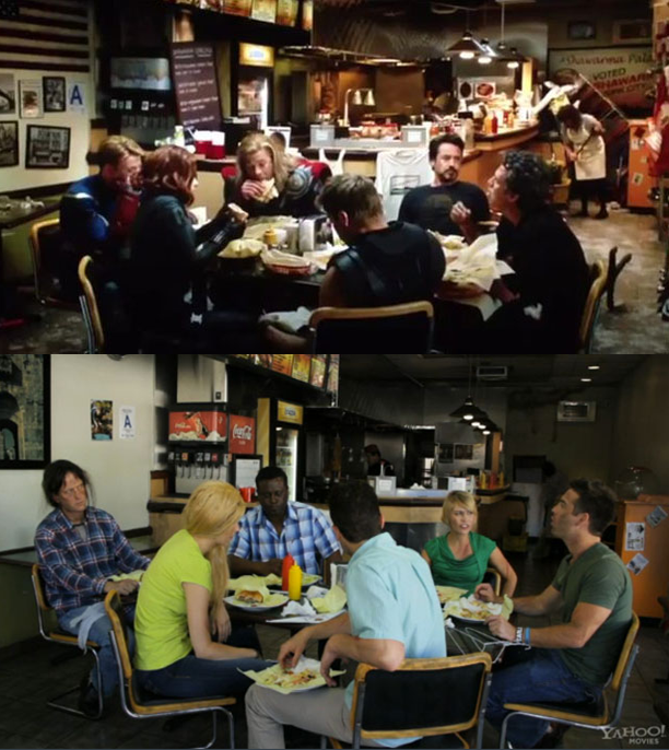
An excellent example of what I am ALWAYS saying...
There is a difference between an exposed image and a lit image.
That second one is exposed - everything can be seen - it's even
in focus for the most part.
Lighting is essential.
There is a difference between an exposed image and a lit image.
That second one is exposed - everything can be seen - it's even
in focus for the most part.
Lighting is essential.

Heh, it took me a minute to realize those are the same sets. But I don't recognize the second scene.
Haha. Nice recreation. And that was the best after-the-credits-bonus-scene ever.
Lighting? Definitely, a HUGE difference.
...but having a set dresser and dedicated post-production colorist certainly helps...
I don't think the first picture was designed to look like that. Heck, they didn't even bother with composition. And I don't think it was graded either. And still looks good.
I wonder what's the bare minimum to spend to get enough lighting equipement. I hear so much about worklights but I'm kindda skeptical and actual filmmaking stuff seem so expensive.
The only difference I see is that the second image is not a still from an overrated piece of pop trash.
Absolutely it was designed. Every prop, every picture on the wallI don't think the first picture was designed to look like that. Heck, they didn't even bother with composition.
was placed there by the art department team. The production
didn’t just walk into the room, set up lights and roll film. They
didn't bother with composition? Look again. Everything in that
first shot is exactly where it needs to be including the slightly
higher angle and the shorter lens then the second picture.
Notice how the Coca-Cola signs are removed? Even the DPH
rating is changed - from the LA tag in the second picture to the
NYC in the first one.
The only difference I see is that the second image is not a still from an overrated piece of pop trash.
Satan's Blind Gatekeeper: "You have much hatred and vengeance in your heart... you may pass"
Absolutely it was designed. Every prop, every picture on the wall
was placed there by the art department team. The production
didn’t just walk into the room, set up lights and roll film. They
didn't bother with composition? Look again. Everything in that
first shot is exactly where it needs to be including the slightly
higher angle and the shorter lens then the second picture.
Notice how the Coca-Cola signs are removed? Even the DPH
rating is changed - from the LA tag in the second picture to the
NYC in the first one.
I didn't realize it was the same place. I just thought the first one was on set and the second one an attempt at mimicking it. That's because I never saw this scene
 .
.So yeah, you're right (as always ?).
both are very similar but lighting is quiet good in second one, so look at that again
black man's facial impressions not showing well. so i think he must change his place with in front of man or otherwise need add 3200k 2 lights in corners. oh don't use lights directly their faces they will burn
use white board or something and get lighting reflections for this place.")
this is my personal opinion
black man's facial impressions not showing well. so i think he must change his place with in front of man or otherwise need add 3200k 2 lights in corners. oh don't use lights directly their faces they will burn
use white board or something and get lighting reflections for this place.
this is my personal opinion
Can anyone tell just by looking at it how was the first shot lit ? I feel it's lit from above because the table is evenly lit and the shadow's on faces are not always on the same side (Robert VS Thor).
There does appear to be an overhead light, as for the rest of it I don't know.
haha, I havent seen this movie so it took me a long time to recognize the actors. Anyway, I don't think either still looks great here. I'm sure it looks a lot better on the big screen / when the picture is moving.
Can anyone tell just by looking at it how was the first shot lit ? I feel it's lit from above because the table is evenly lit and the shadow's on faces are not always on the same side (Robert VS Thor).
i think there was 1 or 2 lits only. one on the ceiling may be other one in right side
just look at the beer counter to see that lits
