Hey everyone, so I'm getting ready to shoot my next short but I really would like to get some nice color with this one. I know pretty much nothing about color correction but one of my crew members has taken into learning the process. Now he tells me when I am shooting, I have to mess with the settings on my camera to make the color correcting process easier, something about bringing all the colors down or something IDK. I will be shooting this short on the Canon T1i. Can anyone tell me the best settings I need to be on when shooting?

-
 ✅ Technical and creative solutions for your film.
✅ Screenplay formatting help, plot and story guidance.
✅ A respectful community of professionals and newbies.
✅ Network with composers, editors, cast, crew, and more!
🎬 IndieTalk - Filmmaking and Screenwriting help site and community.
By filmmakers, for filmmakers since 2003
You are using an out of date browser. It may not display this or other websites correctly.
You should upgrade or use an alternative browser.
You should upgrade or use an alternative browser.
Color Correcting Noob
- Thread starter WGCProductions
- Start date
Exposure is the key:
Expose for the highlights, use lighting to bring the subject up to the correct exposure (around 85% for caucasian skin), use costuming and make up to prevent the subject from over or underexposing... then light the shadows to bring them just into exposure a little bit so that the bits of the frame that are actually COMPLETELY black just barely touch 0%.
This will give the colorist the most to work with in the image. Bringing levels UP in post will result in revealing noise and flaws in the image... so generally, you want to add enough light to allow the colorist to bring the levels down slightly, while still bringing enough of a range to the image that they can grab onto different "Zones" of luminosity (wiki ansel adams' zone system). The saturation, therefore should be treated the same way, it's easier to desaturate than to re-saturate... so shoot the scene as you see it on set and give the colorist the most information you can for them to work with.
Now he tells me when I am shooting, I have to mess with the settings on my camera to make the color correcting process easier, something about bringing all the colors down or something IDK.
He's probably talking about shooting flat.
Google or search IT for flat color vs in camera color. Or terms like that to read and learn more abt it.
Knightly's advice is good. You can just follow that if u like.
Color starts in production design too! Notice how people match and the background matches and the contrast (or lack there of) in these shots.
Very good tutorial video worth watching, even if you don't use colorista. Principals are the same:
http://library.creativecow.net/articles/maschwitz_stu/red-giant-blockbuster-film-look.php
If you don't plan color in preproduction, then when you want to bring certain colors out in post they probably aren't there to work with. Then you have to do a wash, and the difference in pro and amateur color is fleshtones. Flesh has to stay flesh colored (except in a few situations). Watch through some of the big Hollywood releases. Even if every other color is blue or green or whatever, flesh is still orange/brown.
Attachments


You may want to look into and experiment with Technicolor's CineStyle Picture Profile:
http://www.technicolor.com/en/hi/cinema/filmmaking/digital-printer-lights/cinestyle
That, along with using these settings:
Sharpness: 0
Contrast: -4
Saturation: -2
Color Tone: 0
When you first shoot flat, you may think the image is pretty dull. But it will help give your colorist more latitude in post.
A couple other things... try to keep your ISO multiples of 160. (ie. 160/320/640)
You may want to disable Highlight Tone Priority.
The above setup is what I use on both my Canon 7D and t2i.
Color starts in production design too! Notice how people match and the background matches and the contrast (or lack there of) in these shots.
Very good tutorial video worth watching, even if you don't use colorista. Principals are the same:
http://library.creativecow.net/articles/maschwitz_stu/red-giant-blockbuster-film-look.php
If you don't plan color in preproduction, then when you want to bring certain colors out in post they probably aren't there to work with. Then you have to do a wash, and the difference in pro and amateur color is fleshtones. Flesh has to stay flesh colored (except in a few situations). Watch through some of the big Hollywood releases. Even if every other color is blue or green or whatever, flesh is still orange/brown.
I love that shot from transformers 2. Notice everyone in the shot has green hair, except Shia Labeouf.
Thanks everyone for the replies. I believe my colorist was talking about shooting flat. All of your recommendations have been a great help! Thanks again!
Color starts in production design too! Notice how people match and the background matches and the contrast (or lack there of) in these shots.
Very good tutorial video worth watching, even if you don't use colorista. Principals are the same:
http://library.creativecow.net/articles/maschwitz_stu/red-giant-blockbuster-film-look.php
If you don't plan color in preproduction, then when you want to bring certain colors out in post they probably aren't there to work with. Then you have to do a wash, and the difference in pro and amateur color is fleshtones. Flesh has to stay flesh colored (except in a few situations). Watch through some of the big Hollywood releases. Even if every other color is blue or green or whatever, flesh is still orange/brown.
2nd that.
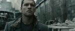
Love terminator salvation color choice. so so sexy!
"Expose for the highlights, use lighting to bring the subject up to the correct exposure"
Dude, if you could just implant that simple principal into the brain of every DSLR shooter in the world, the cinematography we see would take a quantum leap forward.
In my limited DP experience (I only DP when I can't afford to hire one). That is the basic drill. Where is the highlight I can't control (a window, a bright light, etc...) expose so that is just below blowing out, then light the scene for that exposure.
Last edited:
It's the same thing with color balance... if you have a window you can't control... it'll throw blue into your scene. You either white balance to outdoor light (custom whites will always get this wrong - never custom white balance! outdoor and indoor presets only) to get that light to go white and gel your interior lights toward blue to flavor... or balance in tungsten (indoor) which will let the window light throw blue (generally as a rim light/ background light), then gel the incandescents slightly toward blue to get the type of color spearation you want without destroying the wonderful colors that different lights can get you. Revel in your mixed lighting environments, paint with them. Buy each other expensive gifts (sorry, I REALLY love lighting).
I love you guys. Really.
See this is why my significant other doesn't like me to be on Indietalk...

I learned so much in just a few minutes.
I love you guys. Really.
And I love you.
See this is why my significant other doesn't like me to be on Indietalk...
It's FRATERNAL love !
Come on, we're family here !
Sometimes while CC the video came up with a lot of contrast and it make it looks darker, I've been using a light halogen lamp, the AF magic bullet looks plugin and some of make up to waive the sweat, and it resolved my color correction problems.