
-
 ✅ Technical and creative solutions for your film.
✅ Screenplay formatting help, plot and story guidance.
✅ A respectful community of professionals and newbies.
✅ Network with composers, editors, cast, crew, and more!
🎬 IndieTalk - Filmmaking and Screenwriting help site and community.
By filmmakers, for filmmakers since 2003
You are using an out of date browser. It may not display this or other websites correctly.
You should upgrade or use an alternative browser.
You should upgrade or use an alternative browser.
Movie Posters
- Thread starter Zensteve
- Start date
That's a lot of fun, Steve. Thanks for sharing it.
I've always thought it's interesting that Frank Darabont comments about that that trend in movie posters in his film, The Mist.
https://www.youtube.com/watch?v=qQTT6BhxXps&feature=youtu.be
https://www.youtube.com/watch?v=umpnct0fjFo
I don't know though. I have a number of movie posters with the actors' facing photo shopped and floating in the poster and I'm fine with them. They're cool enough for me. Although, maybe they could be cooler.
Great video Steve! Those Eddie Murphy and Seth Rogen bits had me rolling on the floor laughing 
"No wonder people get fooled by The Asylum...."
awesome awesome awesome! i will definitely keep this in mind with my next project.
since we're on movie posters, check out mine for my last project, i know it's not great, but i'd like to see which cliche category it falls under, hopefully none:

HARSH CRITIQUES WELCOME. keeping in mind, of course, that i did not do a photo shoot for the poster (it's an afterthought for a short's promotion, really), so i'm confined to using stills from the project
and i'd love to see others you all have done
since we're on movie posters, check out mine for my last project, i know it's not great, but i'd like to see which cliche category it falls under, hopefully none:
HARSH CRITIQUES WELCOME. keeping in mind, of course, that i did not do a photo shoot for the poster (it's an afterthought for a short's promotion, really), so i'm confined to using stills from the project
and i'd love to see others you all have done
Here's a question: as an indie when your biggest competition is Hollywood, should you try to do what they do in marketing? If you have an action film, and you make your poster a shot of your generic (as in, nobody has heard of him) actor from behind facing the big obstacle, gyn in hand with a orange-teal fade across the entire poster and it's done really well (technically, not necessarily artistically) would it not give the impression that 'this is just as good as a hollywood film"? Only speaking in terms of the impression of production value, not any artistic merit. As sad as it may sound, should we be doing the same things with our posters? It's obviously working for the blockbusters. Sure, nobody may want to hang your poster on the wall, but will it put butts in seats at the theater? Or rather, at a more indie level, sell DVD's?
awesome awesome awesome! i will definitely keep this in mind with my next project.
since we're on movie posters, check out mine for my last project, i know it's not great, but i'd like to see which cliche category it falls under, hopefully none:
HARSH CRITIQUES WELCOME. keeping in mind, of course, that i did not do a photo shoot for the poster (it's an afterthought for a short's promotion, really), so i'm confined to using stills from the project
and i'd love to see others you all have done
I like that it's simple. But if I'm being harsh... the font looks a little bit amateur, and there's too much wasted black space. The arrangement of the actor's names isn't pleasing to the eye.
Speaking of minimalist movie posters...
http://static3.beanscdn.co.uk/modules/SbPicture/picture/minimalist-movie-poster-1.jpg
http://static3.beanscdn.co.uk/modules/SbPicture/picture/minimalist-movie-poster-1.jpg
^
Poster for Jaws:
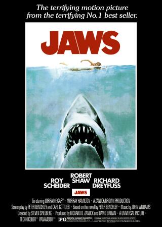
This poster conveys all it needs to in a very vivid way. The size of the shark indicates not it's size in the film but the enormity of it's presence. It is lurking beneath the surface where human eyes cannot see it approach, which is the way in which it operates in the film - unseen until it is too late.
Poster for Jaws:
This poster conveys all it needs to in a very vivid way. The size of the shark indicates not it's size in the film but the enormity of it's presence. It is lurking beneath the surface where human eyes cannot see it approach, which is the way in which it operates in the film - unseen until it is too late.
My favorite movie poster:
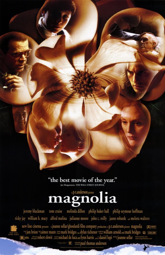
The rich images faded into the Magnolia show the tone of the film - complex and diverse. There is romance, death, resentment, sorrow, and many other presented feelings. The subtle ripple in the middle of the magnolia tells us that these events will affect each other and vary in tone. The rip at the bottom of the page provides for mystery and hints at later events in the film, which gets us interested to see the complexities of these character's lives unfold before our eyes, and the resulting events and random occurrences resulting. It's a mixture of fantastic symbolism, rich colors, and suspenseful hinting. It's highly marketable as well. The star power and review are eye grabbing to casual watchers.
The rich images faded into the Magnolia show the tone of the film - complex and diverse. There is romance, death, resentment, sorrow, and many other presented feelings. The subtle ripple in the middle of the magnolia tells us that these events will affect each other and vary in tone. The rip at the bottom of the page provides for mystery and hints at later events in the film, which gets us interested to see the complexities of these character's lives unfold before our eyes, and the resulting events and random occurrences resulting. It's a mixture of fantastic symbolism, rich colors, and suspenseful hinting. It's highly marketable as well. The star power and review are eye grabbing to casual watchers.
Some of the best posters from 2013: http://www.buzzfeed.com/adambvary/memorable-movie-posters-in-2013
I liked, The Heat, Grand Budapest Hotel, and Gravity. Everything else is missable.
EDIT: Despicable Me 2, August: Osage County, and Nymphomaniac are okay as well.
EDIT: Despicable Me 2, August: Osage County, and Nymphomaniac are okay as well.
Last edited:
Some of the best posters from 2013: http://www.buzzfeed.com/adambvary/memorable-movie-posters-in-2013
Hey, a number of those are pretty good. Kind of undermines the critique.
I like many of the posters, but none of them really grab me, interest me, or even feel that original. Heat and Grand Budapest grabbed my attention and had me looking at them and all the tiny details. Fault in our Stars made me movie to the next like it was never there. It's not that Nebraska or Blue is the Warmest Color are bad posters, but they don't really interest me. Nebraska looks like a simplified Grand Torino cover, and Grown Ups 2 looks like every Adam Sandler movie! It's not that they're bad, but they don't hold some sort of energy or interesting element that makes it unique or really eye grabbing. I saw a lot of great posters in the video that Steve posted, but the problem with them is how overdone the techniques and templates used in them are. Blue is the Warmest Color is a B&W shot of 2 people kissing with the color blue singled out. Kings of Summer are kids jumping in mid air with a quirky font. It's not that the posters are bad, they're just not unique. Not that posters have to be so mind blowing and original, but trying something new might be a good idea.
All my opinion")
All my opinion
I like many of the posters, but none of them really grab me, interest me, or even feel that original. Heat and Grand Budapest grabbed my attention and had me looking at them and all the tiny details. Fault in our Stars made me movie to the next like it was never there. It's not that Nebraska or Blue is the Warmest Color are bad posters, but they don't really interest me. Nebraska looks like a simplified Grand Torino cover, and Grown Ups 2 looks like every Adam Sandler movie! It's not that they're bad, but they don't hold some sort of energy or interesting element that makes it unique or really eye grabbing. I saw a lot of great posters in the video that Steve posted, but the problem with them is how overdone the techniques and templates used in them are. Blue is the Warmest Color is a B&W shot of 2 people kissing with the color blue singled out. Kings of Summer are kids jumping in mid air with a quirky font. It's not that the posters are bad, they're just not unique. Not that posters have to be so mind blowing and original, but trying something new might be a good idea.
All my opinion
Yeah, I also wasn't saying those posters were completely amazing, just sharing the relevant link. The Adam Sandler one was actually in the examples of BAD posters category. The author of the article didn't do a very good job at drawing the line between the sections.
I'm not in anyway justifying the actual movie, but did anyone like the posters for After Earth? Bias aside, they look pretty neat. Particularly this one:
http://e.movie.as/p/124684.jpg
http://e.movie.as/p/124684.jpg