• You are welcome to promote here, but members are also welcome to reply with their opinions.

which Crimps poster is better?

Okay, any latecomers to this thread, I've eliminated the links to my poster designs as they are now moot thanks to the talents of Mr. Paul Griffith (see below).

Sorry, but you haven't missed anything, really. :)
 
Last edited:
I can't get beyond the image of the harbor reflection over either a tunnel or a wharf.
That's totally buggering with me, and maybe there's a germane point of that, but the image is not compelling me to figure out why.

I'd delete the harbor image and just make the two menacing fellows beneath the wharf the central image.

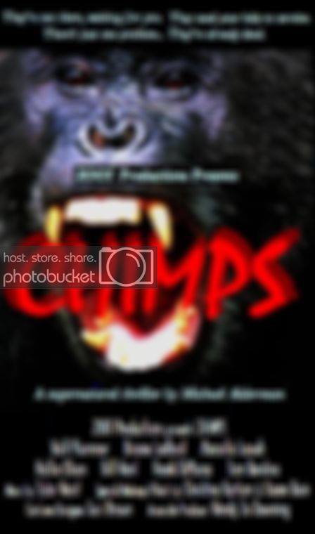
BTW & FWIW, I persist in reading CRIMPS as CHIMPS.

CHIMPS.jpg


:lol: That's a new one. Usually people call it CRIPS, think it's about 80's street gangs.
Gah!
What dumba$$es! :rolleyes:;)
 
Last edited:
I'm a stickler for putting best feet forward, especially when it comes to a huge project like your feature film that you've invested so much time into. With that in mind, 2001, I'd have to say that neither of those posters are making me want to see this movie. Sorry to say...

I'd like to see what Paul whips up.
 
I'd have to say that neither of those posters are making me want to see this movie.

That's good to know, too. Interested in whether it's the images that don't grab you, or the teaser line, logo, layout, or just the combination of everything.

Obviously this isn't the final poster or anything -- that'll be up to a distributor (if I should be so lucky). Just wanted to put something together for a festival to use.
 
I can't get beyond the image of the harbor reflection over either a tunnel or a wharf.
That's totally buggering with me, and maybe there's a germane point of that, but the image is not compelling me to figure out why.

That's exactly how I feel. There should be a continuity to the entire poster, not two different conflicting images. As it is it looks very amateurish, and not something I'd choose to see based on the poster alone. I'd definitely try to find someone with experience in graphic design to make a better poster.

EDIT: The post came off sounding a bit mean, which was not my intention. I'm just trying to give constructive criticism.
 
If I had to put my finger on it, I think the layout and font has the look of an 80s VHS cover.

And I totally understand having something to put out there is better than nothing. Maybe when you get distribution they'll give it a crazy design makeover like Scoopicman's Terrarium or Sonnyboo's H.O.W. Slick packaging is critical for sales and rentals.
 
Thanks, everyone, but forget my crappy little paste-up. Paul just whipped out something that blows mine out of the water (pun intended). I'll put it up (with Paul's permission) when it's final.

I forget how sweet it is to collaborate with professionals!
 
Hey, that does the trick. :) Nice work, Paul. It suits the genre and feels more contemporary.

The tagline up top is difficult to make out and a mouthful, but overall this is headed in the right direction. 2 cents from the sidelines.
 
Hey Paul, great work. Much more compelling layout. Minor quibbles. The tagline at the top is exceedingly difficult to read, a combination of the font and the treatment you gave it. Also I'm not a fan of the font choice for the credits at the bottom. Reads amateur and detracts from the rest of the poster. The singular image focus for the poster, the light beams and the title all work really well. I'm diggin it. Good job!
 
Back
Top