"Sophie" Poster

Now that we submitted to Sundance, I am excited to show you guys the poster for "Sophie".

RGB_POSTER_60x90cm_2_zps86a3292b.jpg


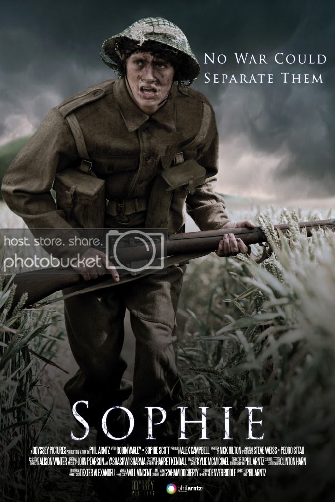
Any thoughts welcome!

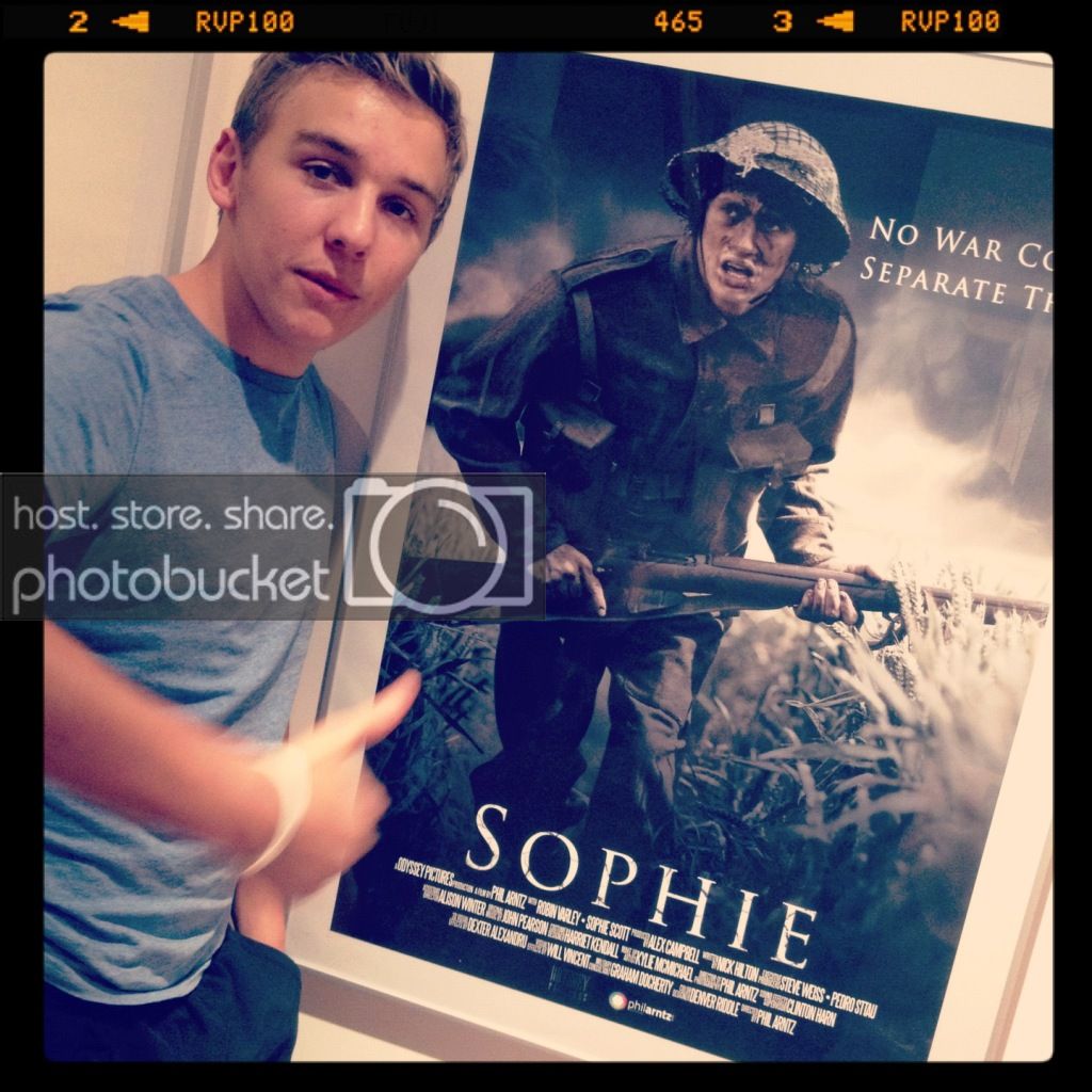
EDIT: In case you follow me on Twitter, Facebook or Instagram, you might have seen me cheekily pose in front of the poster. It's huge. Or I am small. You decide. (Poster is 90 x 60 cm) :)

IMG_4961_zps46017c4e.jpg
 
Last edited:
Hmm personally I don't like it, the wording at the side of the head annoys me and the image looks too clean cut it feels like its meant to look a bit gritty yet lacks the grittiness but good luck and congrats non the less
 
Very cool, way to go!

Perhaps oddly enough, I think I might like how the poster looks in the photo of you posing before it better. I don't know...maybe it's the sepiaishness of it, or something...since it's a period piece n all?
 
Perhaps oddly enough, I think I might like how the poster looks in the photo of you posing before it better. I don't know...maybe it's the sepiaishness of it, or something...since it's a period piece n all?

Whilst I do really like the poster, I kind of agree with this assessment.

I think it's the blown-out sky behind the clouds and over exposure on Raikes' left arm that make it look really cool.
 
I think it's the blown-out sky behind the clouds and over exposure on Raikes' left arm that make it look really cool.

Ah, I think that's what it is. Those things that Nick describes might give it more of a sense of drama, of action, of urgency. Could be interesting just to see a mock-up of a poster that looks like that.
 
Back
Top