Follow along with the video below to see how to install our site as a web app on your home screen.
Note: This feature may not be available in some browsers.
✅ Technical and creative solutions for your film.
✅ Screenplay formatting help, plot and story guidance.
✅ A respectful community of professionals and newbies.
✅ Network with composers, editors, cast, crew, and more!
🎬 IndieTalk - Filmmaking and Screenwriting help site and community. By filmmakers, for filmmakers since 2003
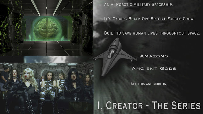
I'm a fan of 'different' so the landscape approach appeals to me. I am curious though as to why you went with it instead of the more usual portrait fashion.
Anyway, imho, you should make the screengrabs larger and give the text a smaller bar to the right. A couple of typos there as well. 'It's' should be 'its' and 'throughtout' should be 'throughout.'
Other than that, I think you know your market segment best and should judge on your own what appeals to them. You'll get different sorts of advice from different genre directors here but what appeals to one genre doesn't necessarily translate to the other.
I think bird is right with the link he posted, you should possibly be looking at something more vintage? and definately lose some of the writing, no one wants to stand and read a poster, it should be an interesting image that conveys the emotion or ideas from the film, almost like describing your film in one word!
The production more specifically looks like a Japanese science fiction film. I found a good four pages with a YouTube search of Japanese science fiction films with a similar look.
The models look fake, the costumes could be better, and the rest of similar problems that plague low/no budget Indie films. These are Japanese science fiction films.