• Wondering which camera, gear, computer, or software to buy? Ask in our Gear Guide.

Editing Progress for digital shots

A while ago I came on trying to get some answers with editing photos and posted some pics. By request some wanted to see how I had been progressing (I didn't know where else to post this-but seeing as this is post-production, and we're using digital (still) photography, it was applicable :)

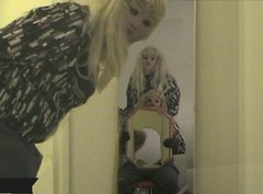
Pics shot with Canon 930zr: this "before" is the first: Original "edit" done on Premiere Elements:

5247269288_5f8c3098f6_z.jpg


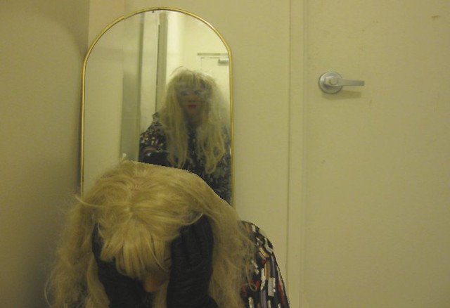
This "after" edited on GIMP:

5246667737_7a2c5fe664_z.jpg


I note it's not the "same" pose, but you can spot the differences (though there are some errors even in this one)

This was my first "GIMP" edited photo-I ended up doing a series of 4 "sisters" photos. If anyone wants to see other pics, PM me and I'll give you my Flickr name. :)


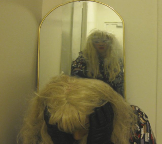
More to follow, but this is for starters :)
 
Learn to cut people out better.

Like I said, I'm still learning- I've only been at this at most 4-5 months :)

I deliberately choose the "worst" looking pics to show progress :)

See, I originally used Premiere, and did the "masking" tool, to work around the various characters.

It was only with Gimp I started using "cut/paste" and layering, feathering ect. I have other work with is a lot better, but a couple of people asked to see the "process" :)


EDIT: I actually, from an artistic standpoint, was trying to AVOID cutting and pasting: I've seen too many "cut/paste" photos that look just that, lay down a flat background (like chairs) and then cut and paste and put figures down in their "proper" places-I'd rather go the Masking/layering route-overlaying, feathering, blending. It's a lot more work, yes-but I'm not doing this for money-I don't plan on selling these, it's more of a "lets how far I can push this" in creativity: it's the process, not the final product, that is important to me :)
 
Last edited:
much better than the first... Next bit may be some color correction to tie the individual pieces together better. In the second piece, the lower left model has quite sharp edges yet, you may want to cut just outside the hairline of the model, then use your feather to pull the edges back to get a better blend... the rest look pretty good, some contrast overall would help though.
 
much better than the first... Next bit may be some color correction to tie the individual pieces together better. In the second piece, the lower left model has quite sharp edges yet, you may want to cut just outside the hairline of the model, then use your feather to pull the edges back to get a better blend... the rest look pretty good, some contrast overall would help though.

And that's where I go batty-the colour correction/contrast :lol: 
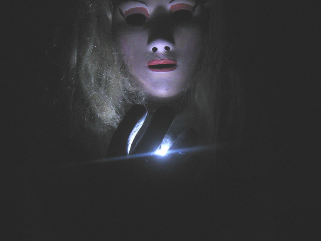
See, part of my problem when I did this photo, I didn't have really good lighting, so playing with the individual pieces was "fun":P


Anyway, other ones I've done I've tried to improve lighting-thanks for the advice about the feathering-I'll try that in future :)
 
I've thought about Photoshop, and might look up using it :)

GIMP was just a good alternative on what I had (Paint LOL) or Adobe Premiere Elements 7.


Maybe if I ever get to the point of wanting to possibly publish them/sell them-that might be the way to go-noise removal would DEFINITELY be a plus! :)

EDIT:

Thanks-these aren't my best work so far-this is earlier stuff- like I said, my avatar is closer to where I am right now :)
 
PS is also scads more expensive than GIMP :)

When getting into blending individual photos into a single composite, it may help to sketch the composite quickly before you shoot any of the pictures, defining the light direction in the sketch, then light each shot for the composite the same way. They will then pull together quite nicely.

For a place to start in the color correction world, I'd start with levels and curves as your main 2 tools. Play with them and figure out how they work... each map incoming color values to outgoing color values, just in a slightly different way.

I have played a little bit with colours as far as levels, but have a lot more to look at :)

The sketching is an interesting idea, something to look at :) I've certainly learned about lighting and how it affects lol.

Thanks for the advice!
 
Another Before/after


5246667791_e7eee62ef7_z.jpg


5247269448_1cf47f16b2_z.jpg


This one I clipped to show more of the mirror, though I wonder if the shot with the door works a little better not so much editing wise(it's not) but just so the eye isn't "forced" to look at the mirror, but is drawn to it-if you understand what I mean ;)

There was no "cutting/pasting" for this shot-it was simply two shots of the same person, one in the mirror, layered with the one hunched over.

Edited by GIMP
 
Here's what I've done with some quick levels and curves adjustment (I used PS, but it'll be about the same in GIMP:

Picture 1.png
The levels set the black and white point so you can adjust the dark to light of your image... the image adjusts the 50% gray point as well to lighten/ darken overall without clipping your whites or blacks.
Picture 4.png
I then raised the blue slightly to offset the yellow/reddish cast of the image overall.
Picture 5.png
Then, there was just a touch of it left, so I pulled the red down just a hair.
Picture 6.jpg
Here's the result I got... for comparison, scroll to the post above.
 
And then I added a slight vignette to draw the eye, you can see it in the lower right corner where the layers are displayed... it's just an oval with the area outside the selection filled with black. I dropped the selection and applied a heavy gaussian blur, then lowered the opacity to taste.

Picture 7.jpg

Using basically the same effect, you can make a white oval over the face of a subject and brighten just their eyes, or the whole face to suit if they're slightly underexposed as well. This one is applied using the "Overlay" blend mode which counts 50% gray as transparent and dark and light having progressively more effect as it gets lighter and darker. The blur amount defines how much transparency gets built into it.

Picture 8.jpg
 
Last edited:
And then I added a slight vignette to draw the eye, you can see it in the lower right corner where the layers are displayed... it's just an oval with the area outside the selection filled with black. I dropped the selection and applied a heavy gaussian blur, then lowered the opacity to taste.

Screen shot 2011-08-19 at 4.48.36 PM.jpg

Using basically the same effect, you can make a white oval over the face of a subject and brighten just their eyes, or the whole face to suit if they're slightly underexposed as well. This one is applied using the "Overlay" blend mode which counts 50% gray as transparent and dark and light having progressively more effect as it gets lighter and darker. The blur amount defines how much transparency gets built into it.

Sketches03jpeg (1).jpg

Sina: It's all good-I just like working with masks, mirrors, light and shadow-just the way I am :) At least it's not boring, that's good! :D


Knightly: Wow! I've seen the curve before on GIMP, haven't played with it much-should do so in future, and I certainly see what you did with the slight shading difference.

Also haven't played much with overlays to the effect you are doing, haven't gotten that far into it yet-but I'd like to: centering the eye on the picture, really working the "art" angle of it all :)

I appreciate all the advice and feedback!
 
No worries... it's all done quickly and a bit heavily... but it's pretty basic relighting stuff, if you have done it before :)

The lightening of the character's face in the window is more how it's supposed to be, unnoticeable and doing precisely what it's supposed to... relighting the scene :)
 
Here's a more "complex" one I tried...

5001231581_0e971d160a_m.jpg


Again, very little cutting and pasting, more "adjusting" than anything-I've had one person say it would make a cool Album cover-I figured Pink Floydish lol


Any one of my newest ones:

5230219270_63d4605c79_z.jpg

(And it was only later that I found out about a similar type shot used in Lord Of The Rings:Fellowship teaser poster lol)
 
The composition and lighting are really cool in that pic... but the image still isn't touching the blacks on my monitor - make sure you're adjusting those levels at the end; both visually and by the numbers. You're histogram should show a ton of 0% black in this photo... I'd venture a guess it's more around 10-15% dark gray. Using the levels, just nudge the darks until the black background becomes black and the pointer sits toward the bottom of the cluster of black at the bottom of the histogram.
 
The composition and lighting are really cool in that pic... but the image still isn't touching the blacks on my monitor - make sure you're adjusting those levels at the end; both visually and by the numbers. You're histogram should show a ton of 0% black in this photo... I'd venture a guess it's more around 10-15% dark gray. Using the levels, just nudge the darks until the black background becomes black and the pointer sits toward the bottom of the cluster of black at the bottom of the histogram.

I have an older tube monitor (need to get get a flatscreen lol), so I was doing visually, not the percentages.

I'll have to play around with it, thanks for the advice.

I enjoyed doing that pic, partially it was out of a "I wonder if I can get this effect" experiment :)

Ernest-Thanks for the compliment on the mirrors pic. I enjoyed making it-it was tricky, and things I would do differently, but fun none the less :)
 
Back
Top