Since Mike Conway (Scoopicman) suggested trading flicks among IndieTalk members, I've had the pleasure of doing so with a couple of film makers who also suggested we review each others' work. I am therefore starting this thread for just that purpose. I hope others will join in and help promote your IndieTalk peers' work! 
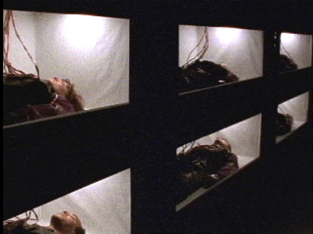
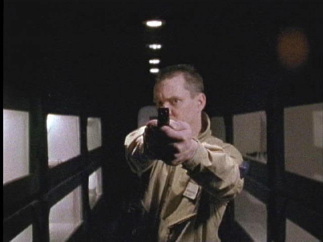
Mike sent me several videos, but I've only been able to watch The Awakening so far. The film making style was similar to his more recent film, Exile (not surprisingly) but with a more tongue-in-cheek tone. A very ambitious production, the cast list was huge! In fact, there were so many uniformed characters with guns running down hallways (many of whom were the same actor, according to the behind-the-scenes doc ) I lost track of which paramilitary units were which and who was supposed to be shooting at whom. It didn't really matter, though, as the primary story was clear enough. There was some really creative use of effects, much of which I was oblivious to until watching the BTS doc. I liked the idea of turning the superhero myth on its head -- in more than one way, really: First, it's a female (anti)hero; 2nd, she becomes a not-so-nice person as a result of her transformation rather than a goody-twoshoes. Helps, too, that the lead actress is a professional model who filled out that impressive costume nicely! Like other reviewers have commented, the ending was a tease (I won't give it away, but those who've seen it know what I mean).
The second movie I watched was Lee Vervoort's (aceofspades70) Gun Town. It's something of a throwback to the slasher movies of the 1980's, a genre of which I was never particularly a fan so I'll just stick to the technical aspects. This is a very good-looking movie. The saturated colors and daytime setting are unusual and creative choices for a horror movie. The use of the prime lens adapter - a gizmo I only recently became aware of - gave the footage a shallow, film-like DoF. The location was amazing; what a fabulous asset to have for this type of production! Plus, like The Awakening, the leading lady was very easy on the eyes. There was one point in particular that took me out of the movie because of the way it was shot. Beware, spoilers ahead!
Thanks, guys! I hope others will chime in on this thread.

Mike sent me several videos, but I've only been able to watch The Awakening so far. The film making style was similar to his more recent film, Exile (not surprisingly) but with a more tongue-in-cheek tone. A very ambitious production, the cast list was huge! In fact, there were so many uniformed characters with guns running down hallways (many of whom were the same actor, according to the behind-the-scenes doc
 ) I lost track of which paramilitary units were which and who was supposed to be shooting at whom. It didn't really matter, though, as the primary story was clear enough. There was some really creative use of effects, much of which I was oblivious to until watching the BTS doc. I liked the idea of turning the superhero myth on its head -- in more than one way, really: First, it's a female (anti)hero; 2nd, she becomes a not-so-nice person as a result of her transformation rather than a goody-twoshoes. Helps, too, that the lead actress is a professional model who filled out that impressive costume nicely! Like other reviewers have commented, the ending was a tease (I won't give it away, but those who've seen it know what I mean).
The second movie I watched was Lee Vervoort's (aceofspades70) Gun Town. It's something of a throwback to the slasher movies of the 1980's, a genre of which I was never particularly a fan so I'll just stick to the technical aspects. This is a very good-looking movie. The saturated colors and daytime setting are unusual and creative choices for a horror movie. The use of the prime lens adapter - a gizmo I only recently became aware of - gave the footage a shallow, film-like DoF. The location was amazing; what a fabulous asset to have for this type of production! Plus, like The Awakening, the leading lady was very easy on the eyes.
 There was one point in particular that took me out of the movie because of the way it was shot. Beware, spoilers ahead!
At the end, when the dad is on the water tower about to shoot the bad guy, I wasn't given a sense of the geography of the sequence, which made it really unclear about what was happening until it was over. I didn't realize the psycho had his kit on backwards until afterward, then I backed up and pieced the sequence together. A low angle looking toward the front (really the back) of the killer with the water tower over his shoulder and the dad taking aim would have solved it, I think.
Thanks, guys! I hope others will chime in on this thread.
Last edited by a moderator:


