I have to agree about the font problem.
The font you used at the top if some pages and the splash page are pretty much un-readable. The "C" is not readable. I mean you know what it is because you put it there, but you have to think of the audience. If you're catering to taggers and graffiti artists, then it's fine.
Also the capitalized old english font on the buttone is a little hard to read as well. Old English has ornate capital letters to make the first letter of the name or sentence stand out.
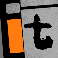
The links button was cool because it was lower case.... easy to read.
the order and about us buttons don't work for some reason.
Now off the site.....
That's awesome that you got a distro deal. How did you go about getting it distributed, and who is your distributor?
