• READ BEFORE POSTING!
    • If posting a video, please post HERE, unless it is a video as part of an advertisement and then post it in this section.
    • If replying to threads please remember this is the Promotion area and the person posting may not be open to feedback.

website Infinitus - An atmospheric scifi film using practical FX

Hi everyone.

Here is the main website for our upcoming scifi film.
www.infinitus.space

A lot of work has been put into this, so we hope enjoy looking through the gallery, at the profiles, and getting hyped for our eventual release of the film.

Site.png
 
I found the site a little static, and I didn't know the orange navigation was the main nav for things like the gallery. It's almost hidden like a TOS link.

The main image is cool though.

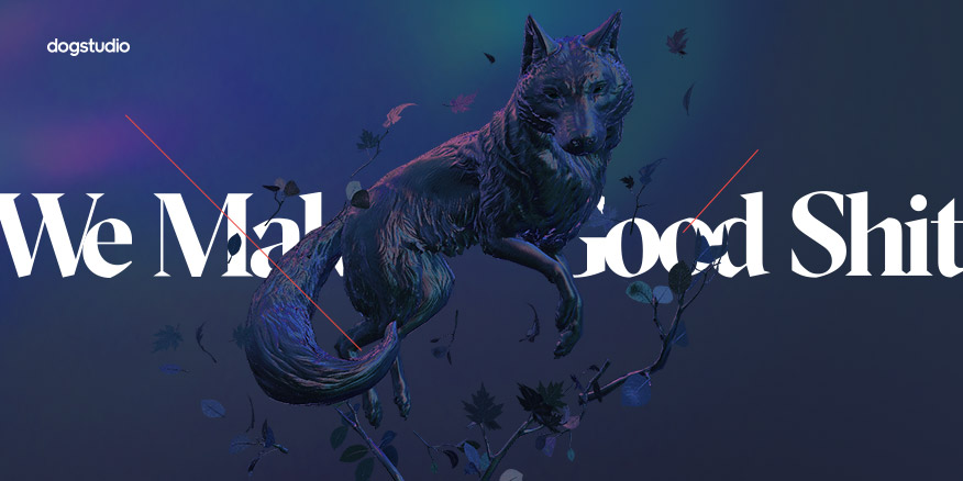
It would look awesome with some parallax scrolling like:
 

Ahhh - that brings back memories! I took inspiration from the HotDot site when building a website for the festival with which I'm involved (only available now on the Wayback Machine ). That was a fun lesson in the perils of working for free (because you've got the skills) for people who haven't the faintest idea of what's involved. :grrr:

On topic (and arising from the preceding paragraph): I can understand why @onebaldman would/might not divert additional resources into adding extra glitz and glamour to the website at this stage in the proceedings - the Law of Diminishing Returns very much applies, especially these days when people insist on using smartphones to browse the web instead of something with a decent 20" HD screen! :rolleyes:
 
It's true it's just something I expected for some reason! I hit my scroll wheel and it didn't move, and I pictured parallax of that planet/thing on the right. :D
 
Oh yeah, the screenshot in post 1 is different.

Well if you could parallax the sky, text, and planet independently that would be sick!
 
Well if you could parallax the sky, text, and planet independently that would be sick!

It would!

The problem these days (and why I've pretty much given up on web design) is that these really cool effects are completely wasted on a small-screen audience. Not only that, but our Glorious Overlords penalise websites that don't conform to their bland, mobile-friendly "flat" design, and double whammy-points for creating one site that looks great on a proper screen and another stripped down version for people with vertical eyes! Your (valid!) criticisms disappear when the site is viewed vertically on a phone or a tablet (10" tablet is better)

The other challenge to really slick, really creative design is that in the good ol' days, you knew your conservative audience would be browsing on a 4:3-sized screen and the young and hip on a 16:9 monitor. As an artist, proportions matter! Nowadays, you have no control over the size of the canvas on which your work will be seen - it could be anything from 1:1 to 2.35:1, and from 4" to 50". Coding for all that variability is a nightmare, drags down your load speed ... and you've still only got a home page! :contract: :cry:

Sorry @onebaldman for going off on a bit of a tangent ...

Back on topic: in the cast & crew biographies, one phrase grated a little: for each of the actors the bio finishes with "in this film [actor] plays [character]". If this isn't an industry convention that I'm unaware of, wouldn't it be better to move that phrase to the start of the actor's bio, e.g. Chelsea Murphy (plays the main character 'Rachel') is an actress and writer ... ? Just a detail, though - don't waste (too much) time on it!
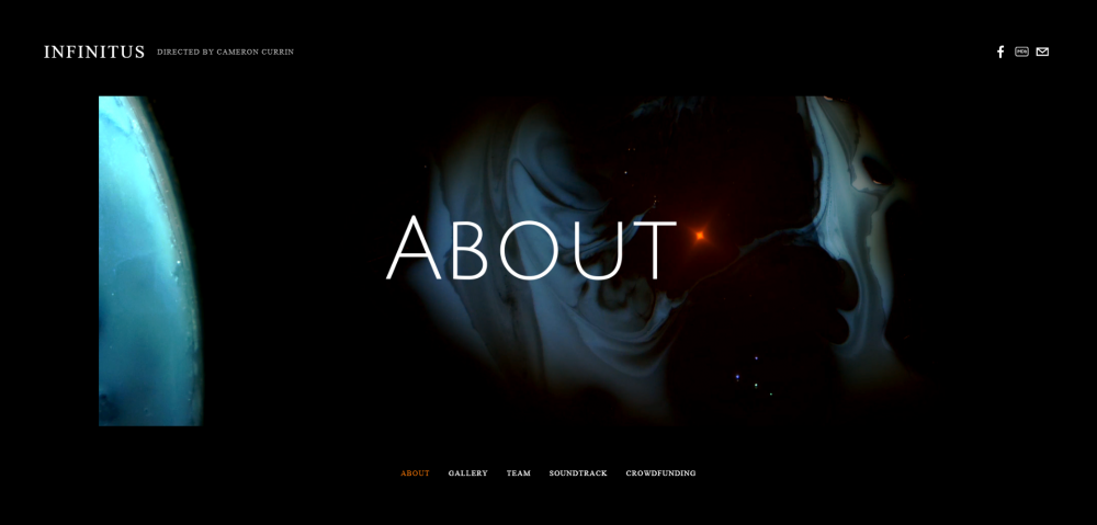
 
I like the ideas, I have since changed some parts. I am using squarespace (I'm no web designer by any means), so I am limited in my abilities to improve the asthetics.

I noticed the theme I was using looked garbage on a phone (which is where most of my audience comes from according to stats), so I changed the theme and created a simple landing page.

It's still a little flat, but really its currently just a place people can find links to the other parts/pages for the film. The wow moment is going to come from the teaser I'm working on, which will greet visitors as soon as they visit the page near the end of the month.
 
I would take those orange links and put them at the top, larger font, with some space from the top (about an inch on a normal monitor) and I'd leave the orange social media icons where they are. The way you have it now your main nav gets lost! And how about a page with the details of the film? I see Team | Gallery | Crowdfunding and that's it. :)
 
I would take those orange links and put them at the top, larger font, with some space from the top (about an inch on a normal monitor) and I'd leave the orange social media icons where they are. The way you have it now your main nav gets lost! And how about a page with the details of the film? I see Team | Gallery | Crowdfunding and that's it. :)

Thanks for the feedback. I have made some changes to reflect your thoughts. Only thing I can't seem to change with Squarespace is the layout of the landing page.

For now it seems static, but later it will have a full screen video to click on, so it should definitely be sexier.
 
I would take those orange links and put them at the top, larger font, with some space from the top (about an inch on a normal monitor)
Only thing I can't seem to change with Squarespace is the layout of the landing page.

That's the problem with website-builder services. Their templates have to anticipate the needs of both the people designing the page and the people viewing it. This inevitably imposes limits on creativity and layout. To relocate the links for a monitor requires additional code, which is easy enough to add on a custom build but rarely an option when using an off-the-shelf template. It's "just" a long string of IF/THEN commands ... but someone, somewhere, has to sit down, look at each and every one of the hundreds of different "viewport" settings and decide what should or shouldn't be displayed and at what size and in what position. Y'all know what that means: 💰💰💰
 
That's the problem with website-builder services. Their templates have to anticipate the needs of both the people designing the page and the people viewing it. This inevitably imposes limits on creativity and layout. To relocate the links for a monitor requires additional code, which is easy enough to add on a custom build but rarely an option when using an off-the-shelf template. It's "just" a long string of IF/THEN commands ... but someone, somewhere, has to sit down, look at each and every one of the hundreds of different "viewport" settings and decide what should or shouldn't be displayed and at what size and in what position. Y'all know what that means: 💰💰💰

I've also used custom wordpress templates in the past that offer some flexibility, but I had to go through an external host and domain service like BLUEHOST or GODADDY to do it.

With this, I can get something up quickly, without adding ANOTHER thing to manage on my plate. Hopefully, it isn't too big of a drawback to prevent people from clicking/sharing.
 
Back
Top