Honest Feedback on prodco website

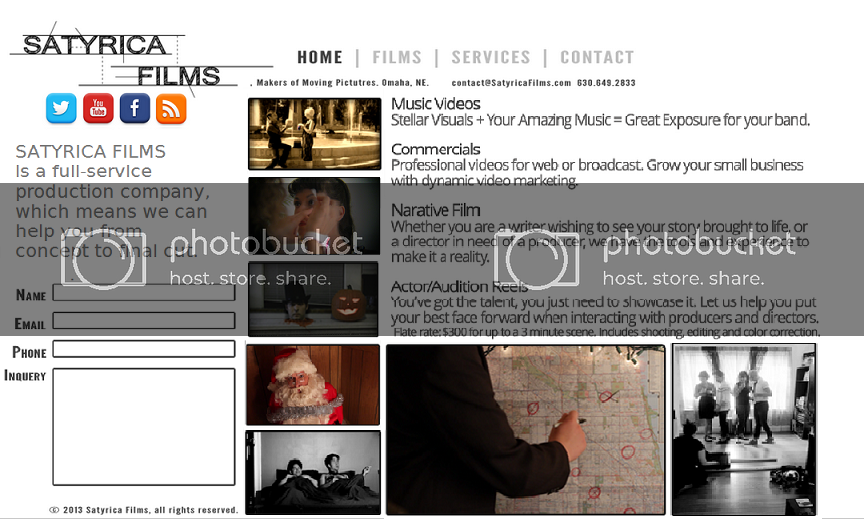
If any of you guys have a minute, I'd love some honest feedback on the site I've been working on. I haven't coded it yet, this is just a design concept. The only pages missing are the individual film pages which will be reached by clicking on the posters on the 'Films' page. They will include the poster, credits, description and a 'watch' link that will pop up in-window with a youtube video.

Album: http://imgur.com/a/VNrKf

Feedback on any and all aspects (design, flow, copy) would be great! Thanks!
 
Hi Dready-

I like the layout, straightforward and clean.

Couple of things hit me straight-away: The horror film shots say "narrative" in a heavy way, but you advertise commercials at the top of the Services page... You have other shots that indicate narrative work, so wondering if you could replace the horror shots with obviously looking commercial work. The other thing, and this is pretty picky, is that the white spaces on the opening page are uneven and give the collage a look of being thrown together. Maybe a little graphic-design flow there might help.

My 2 centavos, best of luck!

kj
 
Don't corner yourself with a flat-rate that appears to include everything, 'cos it rarely works out that way. Allow caveats, in case it ends up costing more for any variety of reasons.

While it's cool you have links to the short films & videos, you need a clearly identified short demo reel that is accessible from the front page without digging around for it.

Inquery is a typo. Should be Enquiry (Many might use Inquiry as well, but even with corrected spelling it's incorrect grammar)

But yeah, aside from that looks pretty good. The site doesn't need a zillion pages or crazy HTML5 effects to be useful. :)

.
 
Just looking at what your local competition is sporting...

http://www.parrotfilm.com/index.html
http://masonvideo.com/
http://www.sleightadvertising.com/
http://www.mrvideoonline.com/index.asp
http://soundsfantasticmv.com/
http://www.video1prod.com/
http://www.iwenexposures.com/v<-- figure out why this page loads so slow, then don't do that!
http://www.amouraproductions.com/
http://www.dundeedigital.com/ <-- this layout is odd and a definite turn off for me.
http://twentytenproductions.net/ <-- this layout sux. Too many fonts and sizes and just generally weird.
http://jordangreen.com/
http://wedding.jfplusm.com/
http://www.northseafilms.com/ <-- too cute for their own good.

Can't honestly say I like any of those layouts.
They're semi-functional. Meh.


After giving the/your local competition a casual once over then going back to your design, wonderful as it is, I would put a great deal of actual information about Satyrica's service on the opening page.

Don't make me go dig for it.

If what I see on the first page interests me THEN I'll dig further, but don't be cutesy artsy fartsy on the opening page. It may be your only shot and likely my last.

Additionally, I think I'd put a contact sidebar + a social media button grouping on each and every page.


I'd also perform some basic research on the most common (not average) desktop and laptop monitor display size and ensure all critical data is displayed in that space so that lazy @ss customers don't have to scroll down for anything other than "pretty stuff."
 
Last edited:
20131203SatyricaFilmsRedesign2_zpsb734b01d.png


Places defining info right on your front page.
 
Last edited:
Back
Top