
-
READ BEFORE POSTING!
- If posting a video, please post HERE, unless it is a video as part of an advertisement and then post it in this section.
- If replying to threads please remember this is the Promotion area and the person posting may not be open to feedback.
You are using an out of date browser. It may not display this or other websites correctly.
You should upgrade or use an alternative browser.
You should upgrade or use an alternative browser.
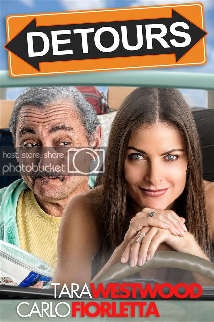
DETOURS feature poster
- Thread starter mlesemann
- Start date
I like it! Nicely done!
Thanks! It was fun to watch the photo shoot & then see (from a distance) how he put the whole thing together. Each actor was shot separately in a studio, then he shot the boxes separately to add to the composite later. Tara was holding a fake steering wheel, which he replaced with one that's more realistic-looking. The car's dashboard was also added in post.
Last edited:
I understand why your road sign has arrows in both directions... but
Have you looked at it with the arrow pointing in one direction without question?
I have a suspicion it would feel more exciting to "take the detour" and watch your film that way.
With a second direction on the arrow it raises confusion, which way do I go? Do I watch the film?
It's just a suspicion and something to consider, if you look at both i'm sure it'll be obvious if i'm wrong.
I've watched the movie numerous times, and I definitely think that the dual-direction road-sign is on point, no pun intended.
Yup - been down all those roads (pun intended).
It's meant to suggest the confusion felt by the characters in the movie, so
we like it this way.
I understood why you made the choice. Well it looks great!
I'll watch it once it's on amazon prime.
I understood why you made the choice. Well it looks great!
I'll watch it once it's on amazon prime.
Nah, see it in a theater, bruh! That's how movies are supposed to be seen!
It looks and sounds amazing in a theater but we've finished our limited festival run plus a few small theaters, so Amazon Prime it must be
I'll certainly be reminding (bugging) everyone as soon as I have a release date.
Roger that. Maybe this would be a good time for another BTS video!

Go watch it!
Incidentally, how do you get a movie onto iTunes and how much does it cost?
Incidentally, how do you get a movie onto iTunes and how much does it cost?
Thanks! I'm going to do a post on my blog later this week about the process of getting the photo & poster done - it was something new and interesting to me.Originally posted by IndieTalk
Gotta see this!
Originally posted by Gorrillaonabike
Incidentally, how do you get a movie onto iTunes and how much does it cost?
You have to work with either a distributor or a consolidator to get a movie on iTunes - they won't work with individual producers. I work with Distribber (www.distribber.com); their FAQ page has a list of prices.
Am I the only person who finds the lighting and composition a bit off? Something about it looks strange. Might just be my monitor though.
I think I get what you're saying.
FWIW this looked better on my phone than on my laptop. I actually think it might be that Tara looks quite photoshopped, so that her skin is very smooth and undetailed, whereas Carlo has a much more detailed face. So it looks like one of them has been polished and the other hasn't. But I think you need to be seeing that on a slightly bigger screen to notice (I'm sure this icon would work perfectly for iTunes/Netflix/Amazon).
Originally posted by NickClapper:
I actually think it might be that Tara looks quite photoshopped, so that her skin is very smooth and undetailed, whereas Carlo has a much more detailed face.
There absolutely is some photoshopping involved - this is for marketing purposes, so I'm fine with everyone noticing that. But if you ever have the pleasure of meeting Tara in person, the first thing you'll notice is how smooth and unblemished her skin truly is - while hers has (I presume) been photoshopped a little, it's also that Carlo's skin has been made more detailed and lined than it actually is to underscore the contrast.
And fyi - his real hair is still almost completely black. We had bleached and colored it extensively for the movie to widen the visual difference between the two of them. It took weeks for it to grow out and we couldn't do that to him a 2nd time for the photo shoot. So we settled for a can of white hairspray from a costume store, which worked surprisingly well - but still with a bit of photoshop help
")
His hair looks great, would never have guessed he wasn't a natural silver fox! I certainly wouldn't have an issue with the photoshopping of either of them individually, it's just the contrast that might draw the eye. I also think the fact that Carlo's wearing a close patterned shirt also accentuates the detail difference.
I think I get what you're saying.
FWIW this looked better on my phone than on my laptop. I actually think it might be that Tara looks quite photoshopped, so that her skin is very smooth and undetailed, whereas Carlo has a much more detailed face. So it looks like one of them has been polished and the other hasn't. But I think you need to be seeing that on a slightly bigger screen to notice (I'm sure this icon would work perfectly for iTunes/Netflix/Amazon).
It does look better smaller, but I think for me it's that it looks like they're not 'together' in any sense of the word (time, space, lighting) - just like two differently lit images plonked together. For me it's one of those things that once you see it, you can't unsee it.
Maybe it's because I used to work with self-published authors a lot, and their covers often suffered from that problem, and this image brought them to mind (they were a lot worse though, obviously
) And if the 'togetherness' (physical or emotional proximity) of the characters is key to the story then that's why the poster doesn't work (for me).None of us will get anything useful out of a bunch of yes men, but she isn't going to be able to reshoot this photography. I think it looks fine, every movie poster actor is shot separately and then mixed together, no one will be under the impression this is a screen shot