• READ BEFORE POSTING!
    • If posting a video, please post HERE, unless it is a video as part of an advertisement and then post it in this section.
    • If replying to threads please remember this is the Promotion area and the person posting may not be open to feedback.

watch Am I lighting it correctly?

There's no such thing as 'incorrect' lighting.

For me, it looked way too lit, but that might have been the look you were going for
 
I kind of like that and not as much of a fan of low key lighting we so often now. Probably cause I am too use to it and like seeing different approaches. It's kind of yellow though, which I personally do not like as much.
 
I think they're talking about this shot specifically:

Screen Shot 2013-12-03 at 11.53.41 PM.jpg

If you look at the shadow cast on his neck by the collar, you'll note that it's unnaturally sharp. You could soften this by throwing a diffusion gel on that back light that is screen left. That would also help dim the "gling" on his hair, cheek bone, and nose from the same light. The exposure in this shot seems slightly higher than the previous as well. Balancing those values between shots (use the exposure meter in your camera or a light meter to be sure they are balanced between setups).

The lights are all in the right places for a well lit shot. I think the specific is just the harshness of the light in this one shot. The wider shots look really good.

I'll assume you wanted him at the same exposure levels as the background for a reason as well. It is, however, easier as a viewer to focus on a subject if they're slightly brighter than the background. You would light them dimmer if you wanted them to be harder to find in the shot for story/emotional purposes. As this is the same level, it doesn't lead the eye to the subject. Some of this could be controlled if you wanted to by throwing a subtle vignette oval on his face that would darken in the edges of the screen with a SUPER soft feathered edge leading outward so it wouldn't draw attention to itself.
 
Last edited:
The contrast ratio (or lack thereof) combined with really hard lights that are a smidge to close to look properly motivated makes the whole thing look too lit for my tastes.

There's potential, it just needs honing for my tastes. All that really matters at the end of the day if you and the Director/client are happy with it.
 
So I played with it a little in GIMP (free, open source photoshop replacement).

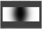
I defined the oval I was talking about (known in the grading world as a "power window") and saved it as a layer mask which I then blurred to 500pixels and deactivated just to make it easy to load.

Screen Shot 2013-12-04 at 12.15.16 AM.jpg

Using the outside of the oval, I pulled the middle slider of the levels down to darken slightly -- which pushed it a little warmer/olive than you had it in the original.

Screen Shot 2013-12-04 at 12.16.05 AM.jpg

I used the curves to get closer to the original palette and desaturated slightly.

I then inverted the selection to work on the face and used the curves to pull those highlights out and balance out the lighting a little bit. It had fantastic separation between light and dark, so the different segments of light on the face were easy to grab onto.

Screen Shot 2013-12-04 at 12.17.51 AM.jpg

Here is my result (take it or leave it, just showing you what these techniques do):
Screen Shot 2013-12-04 at 12.19.24 AM.jpg
 
On set, this would be done by lighting the background darker than the talent by a stop or two, then diffusing your key light to make sure there aren't any "glings" (bright spots) that show off the light you've got blasting at them. Hard edges point to them as well, and the diffusion will help with that.
 
Thanks everyone for your precious feedback,and thanks a zillion Knightly for the time you took to tweak the look of that shot.Much of the yellowish tone some of you talked about is due to the yellow-painted gallery wall.Just to let you know this is my first attempt at "professional" lighting,and this is my second short film.
 
Nice shots and great work by knightly... gonna have to email you about your color correction rates :)

I had a slight issue with the first shot... I would have liked to have seen more color pop in the painting he ends up looking at. I know the subjects eyes take us there, but something to help differentiate the painting from the background more was what my mind wanted. It felt too flat to the wall if that makes sense.
 
Although motivation of lighting is not a crucial cinematography rule,it can help with starting a realistic lighting set up. Pictures are usually lit from above (in museum I mean) so starting with a separate picture light either right on top of the picture frame or rigged to the celing would be a good choice. Following the same logic adding a top light (bounced from ceiling i.e) could be good for general ambiance or as a key. Given walls are very light they will bounce light back ( that's why your shots lack contrast) so your fill will be sorted. You can do a butterfly lighting too.

Another thing to keep in mind is that frontal light flattens dimensions. carefully study photos or just nature,and you will notice how objects become 2D,"flat",it is very amazing when you actually "see" how bushes or trees turn flat when front lit. So generally people try to do a reverse side key light,that is keeping a shadow side of the face towards the camera,hence increasing depth of the frame.
 
Happy to help. I've been at the same point you are, where it's all just starting to click. I figure I've already done the figuring out how it all works together and how to resolve some of the issues you're seeing (which is really detail now rather than broad sweeping problems). I learned much of what I know hereā€¦ I feel compelled to give back where I can.

TWB: feel free to shoot me a PM, I love paid work ;)
 
Back
Top